THROW
HAIR COLOR CARE
beauty experience inc.
PRODUCT / PACKAGING
シンプルに力強く
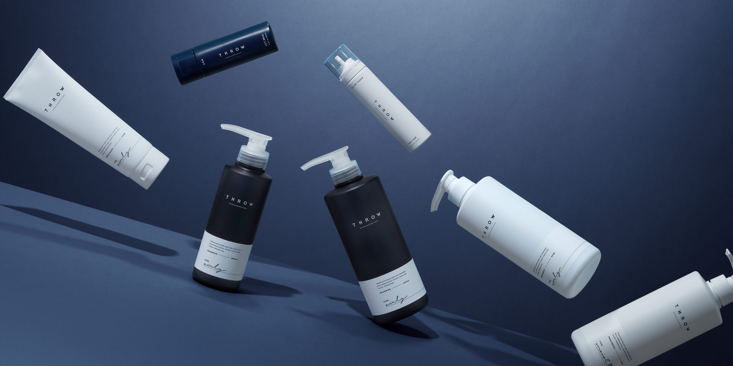
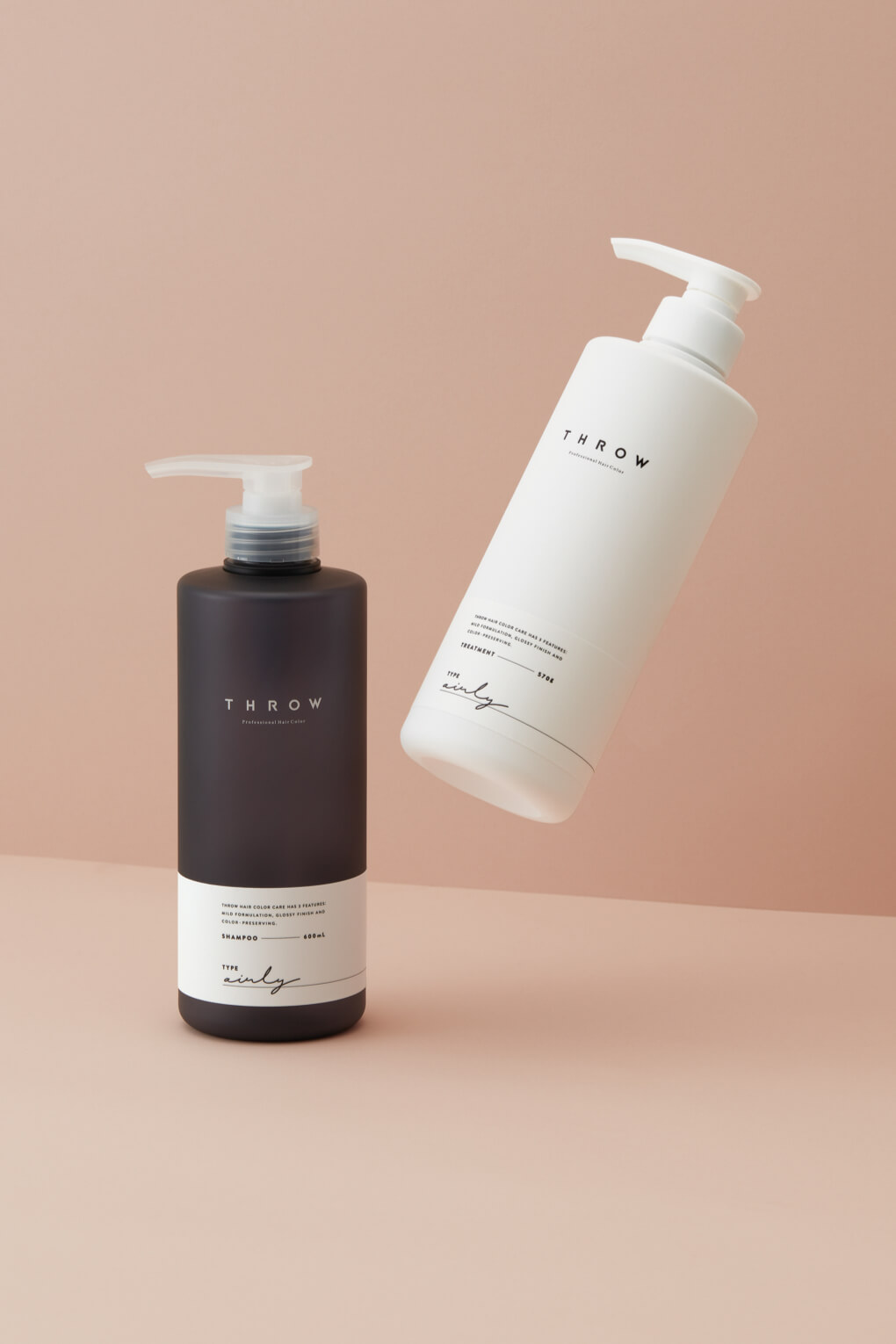
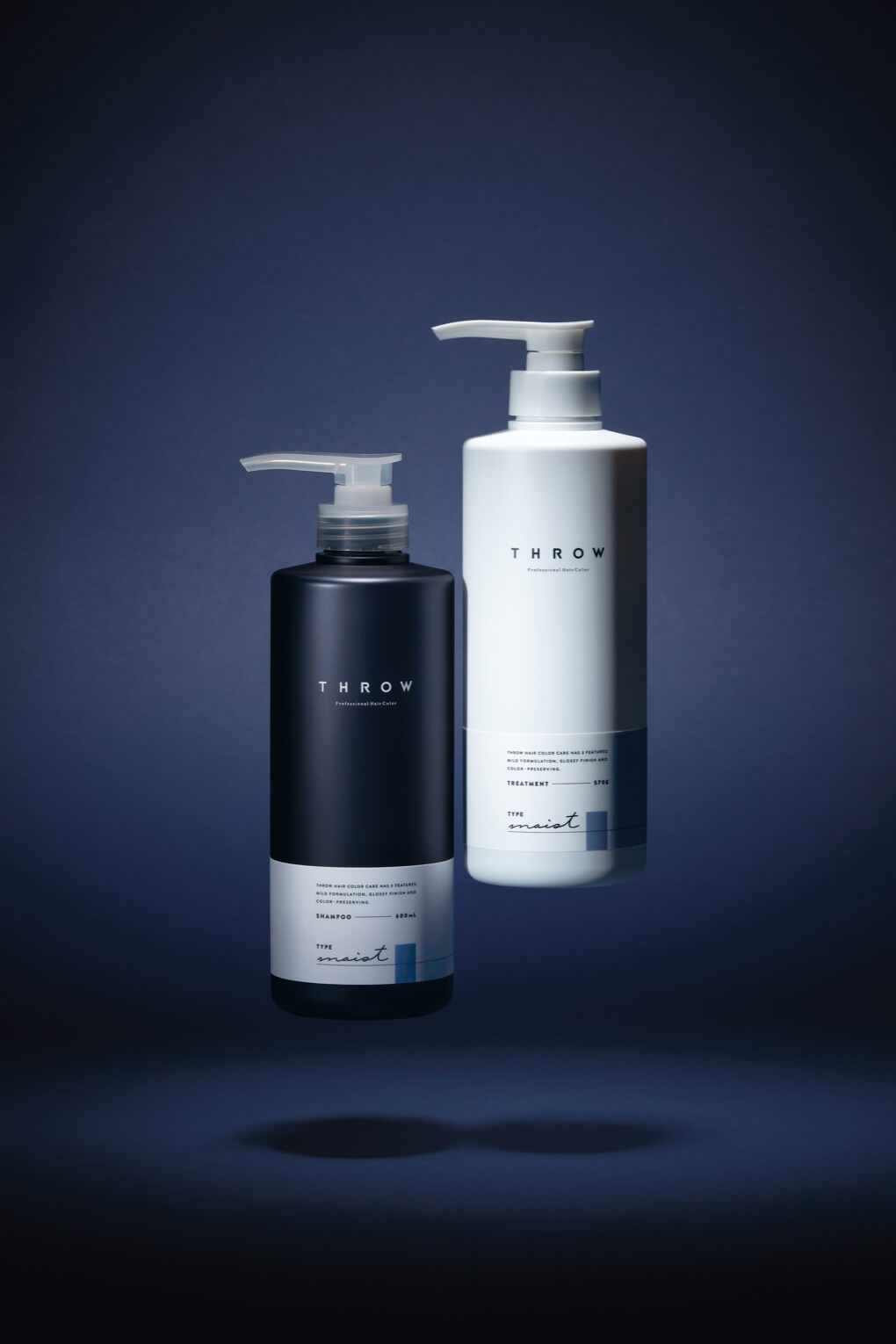
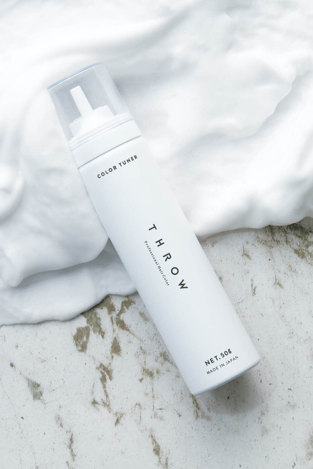
業務用ヘアカラー剤ブランド「THROW」が展開するヘアケアラインのプロダクト・パッケージデザインを担当させて頂きました。機能美を追求し、シンプルに無駄を削ぎ落として展開する業務用品としての”THROWらしい”スタイリングはそのままに、ヘアカラーのダメージ・褪色を抑えるヘアカラーブランドだからこそできる新しい製品展開を行っています。
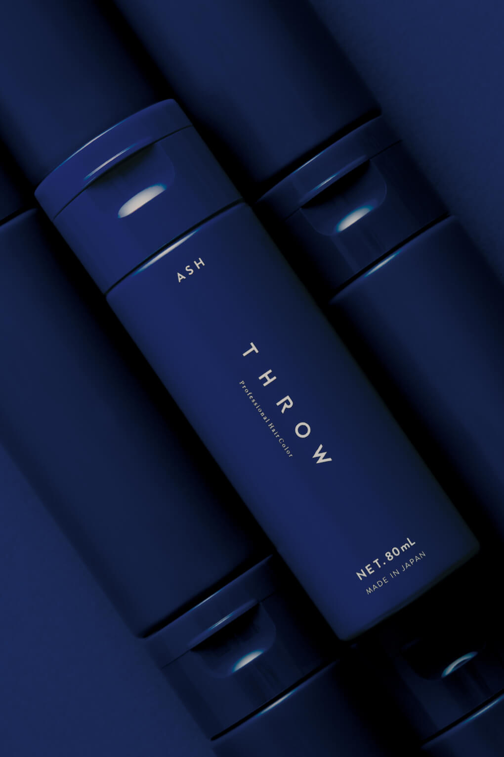
THROWの強みでもある”アッシュカラー”を切り口に、黒に近いほど深い青色のボトルカラーや、カラー剤のチューブでも採用されていたマットな質感など、シンプルでありながらも手にとったときに気づくこだわりがこめられています。
Simple and powerful.
We were in charge of product package design for the hair care line developed by the professional hair colorant brand "THROW". While maintaining the "typical" styling of industrial products that pursue functional beauty and simply cut down on wastefulness, we are developing new products that can only be developed because we are a hair color brand that suppresses damage and fading of hair color.
Using ash color, one of THROW's strengths, as a starting point, the bottle color is a deep blue, almost to the point of being black, and the matte texture used in the tube of colorant is simple, but it is filled with attention to detail that you will notice when you pick it up.