POGG
BRAND SITE
BAKE inc.
WEB SITE
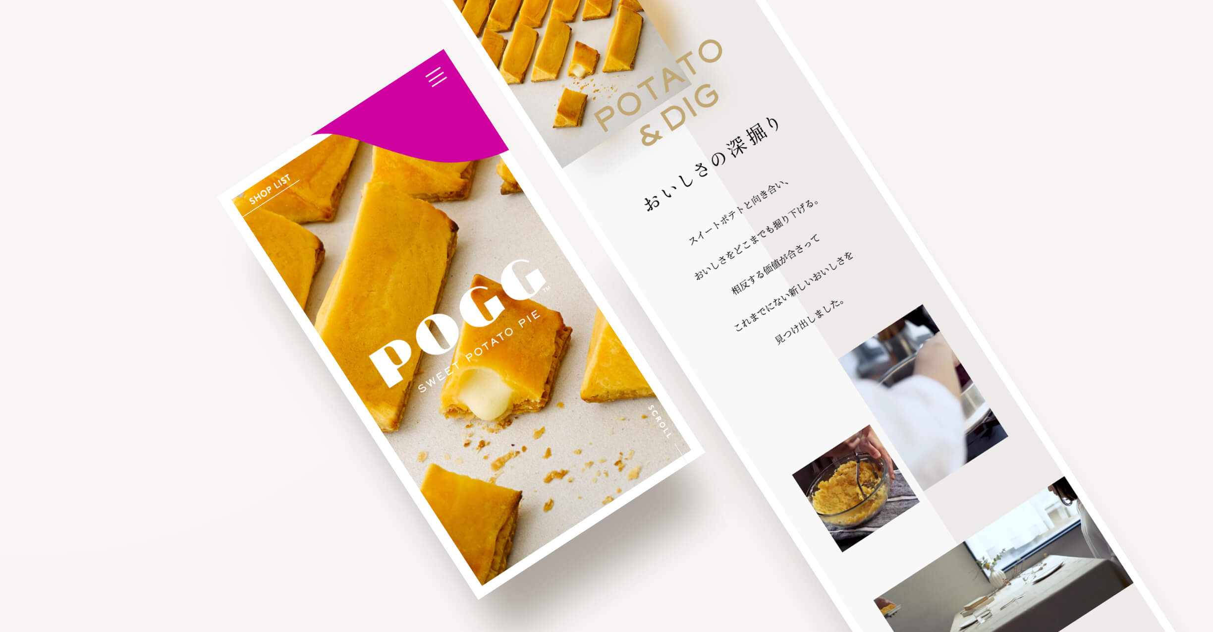
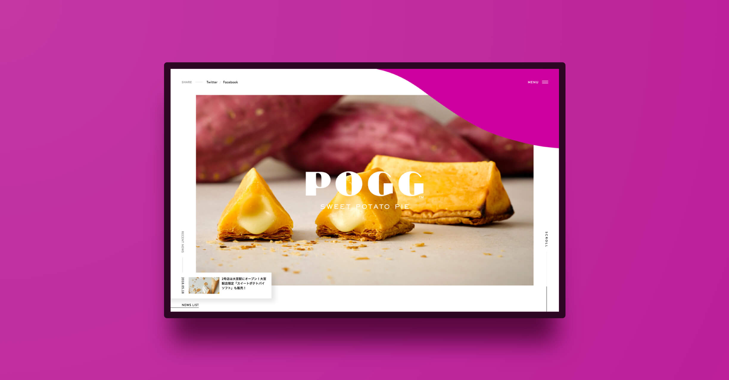
相反する価値の融合
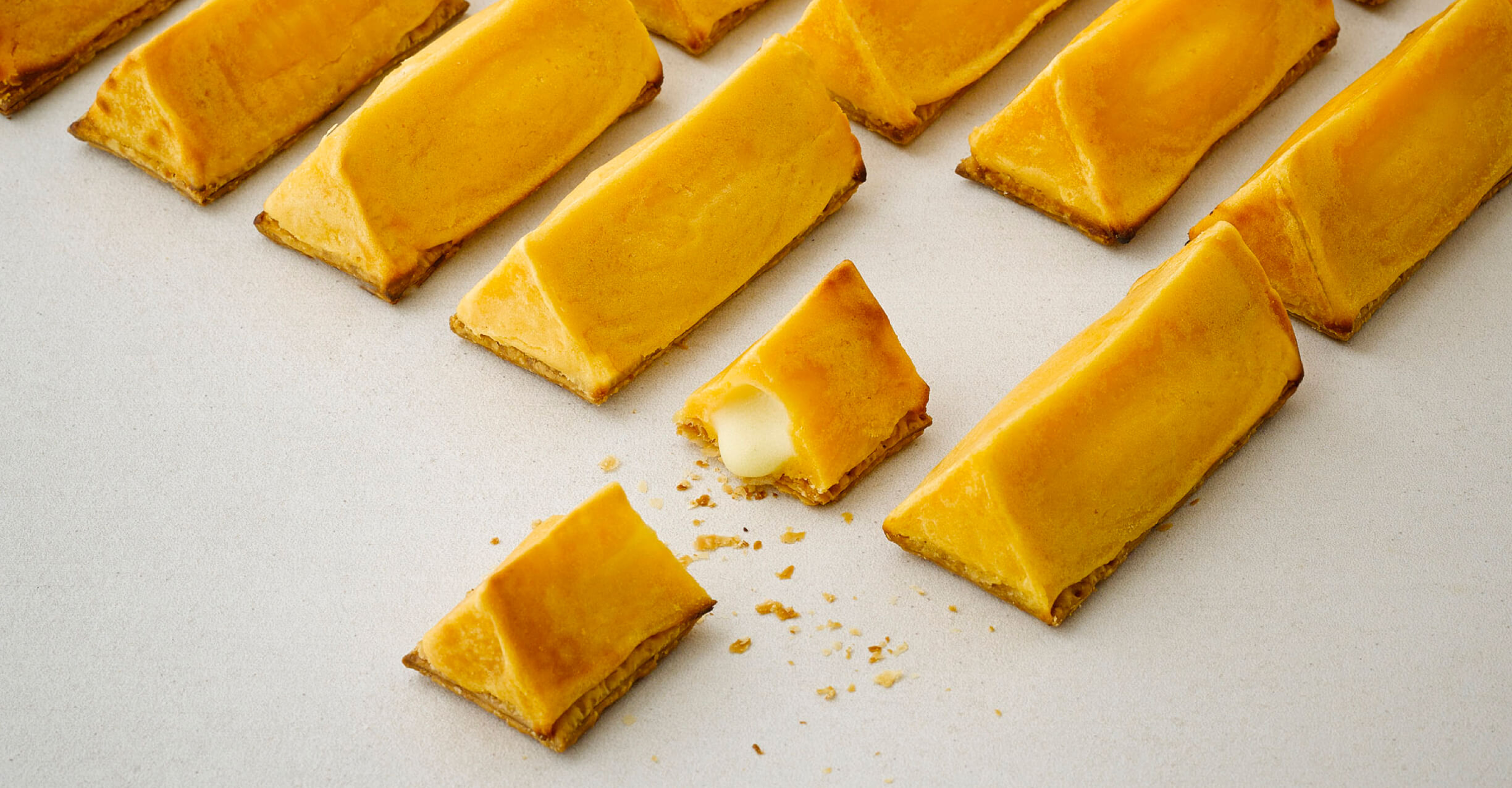
BAKE inc.が展開する、焼きたてスイートポテトパイ専門店「 POGG ( ポグ ) 」のブランドサイトデザインを担当させて頂きました。POGGの製品コンセプトは「わがままを、三角で、ひとつに。」。ほくほく・とろり・サクサク、表情の異なる3つの食感を三角柱のかたちで繋ぐことで、今までのスイートポテトの印象とはひと味違う、贅沢なお菓子に仕上がっています。
The Fusion of Conflicting Values
BAKE inc. designed the brand website for POGG, a freshly baked sweet potato pie specialty store. The concept of POGG is "to be selfish in a triangle. The three different textures of the sweet potatoes are linked together in the shape of a triangular pillar, which gives a different impression from the conventional sweet potatoes.
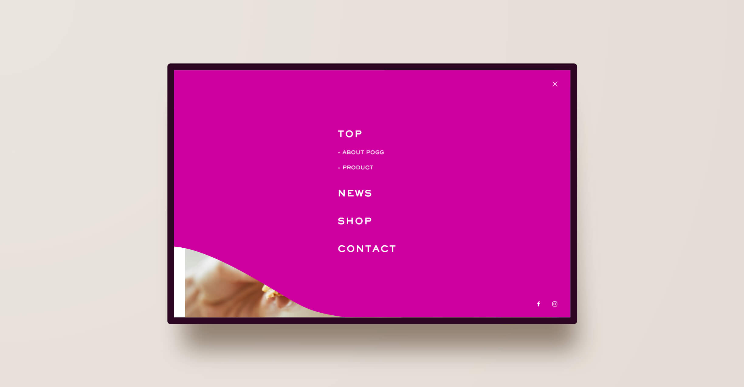
今回、サイトデザインにおいても、相反する価値を融合させることをコンセプトにしています。サイト全体のレイアウトそのものは、まるで雑誌を見ているような文字組み、グリッドを活かした”ソリッドな印象”に仕上げていますが、ローディング画面や存在感のあるメニュー、テキストアニメーションなど細部のインタラクションでは、その真逆の”トロッとしたやわらかい印象”に仕上げています。 ”静”と”動”とで違う価値を掛け合わせることでPOGGらしくもあり、シズル感も溢れるサイトになりました。
The concept of the site design was to fuse contradictory values. The overall layout of the site has a "solid impression" with a magazine-like layout of text and a grid, but the loading screen, the menu with a strong presence, and the text animations and other details are all designed to make the site look like a magazine. Interaction is the exact opposite of that, with a "soft and smooth impression". By crossing the different values of "stillness" and "motion," we have created a site that is full of sizzle and has a POGG feel.

HEADING
Sackers Gothic - Regular

TEXT
Noto Sans CJK - Regular