MAMANARU GOHAN
Chav co.,ltd.
BI
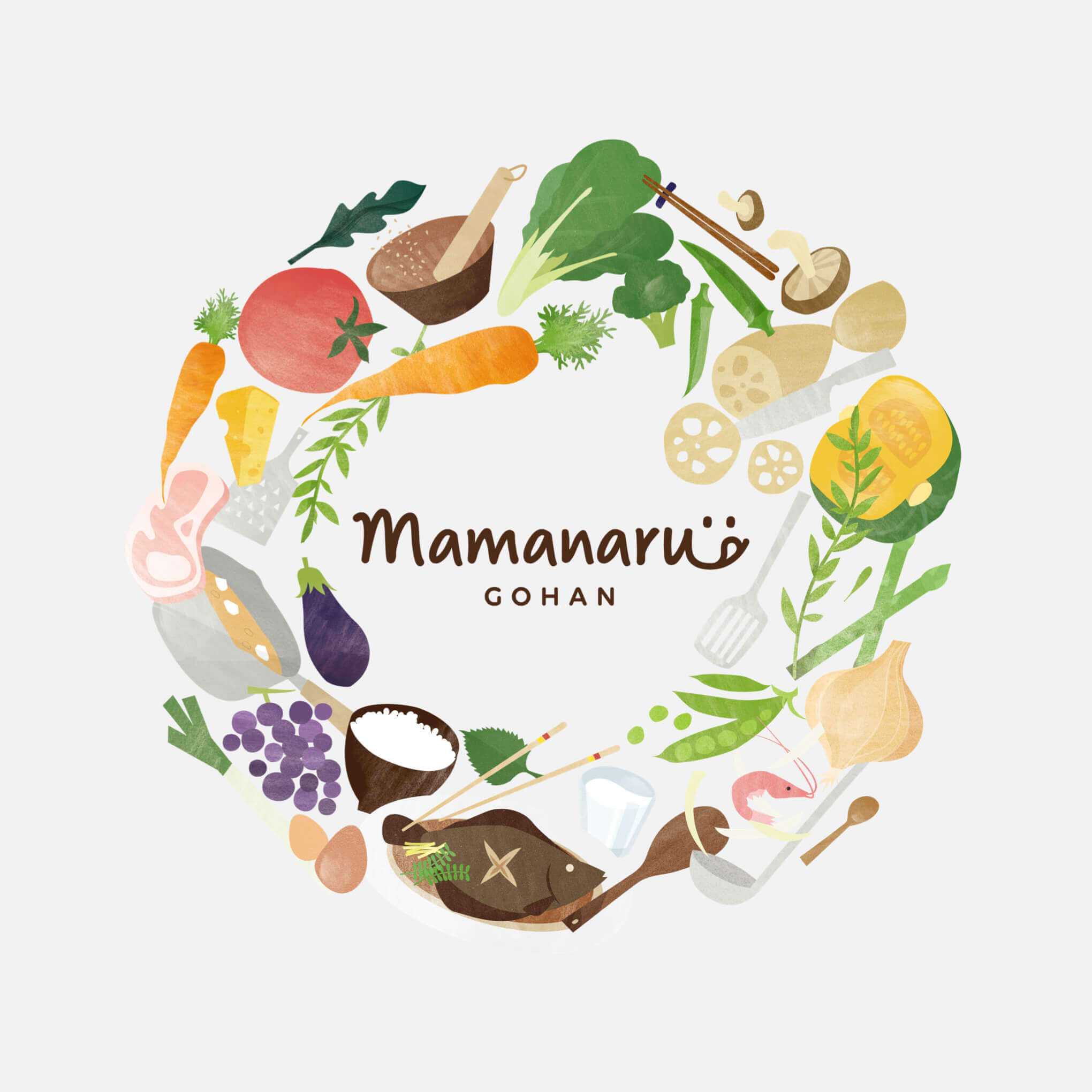
食事の楽しさや美味しさが伝わるデザイン
産前・産後の女性に向けた食事宅配サービス「ママなるゴハン」のロゴデザインをさせていただきました。
シンプルでありつつも食事のサービスである事が伝わり、尚且つ食事の楽しさや美味しさといったポジティブな印象を与えられるデザインを目指しました。食卓の彩りを少しでも感じられるようにロゴ単体だけではなく、食材や料理、調理器具といったモチーフイラストが周囲に散りばめられています。
「ママなるゴハン」は産前・産後の方に向けたサービスではありますが、今回デザインを進める上ではそういったサービス"らしさ"が強く出過ぎないように意識されています。あくまで食事の楽しさにフォーカスさせる事で、サービスを利用される方だけでなく、より多くの人に興味・関心を持ってもらえるビジュアルに仕上がり、結果として他サービスとの差別化にも繋がりました。
Design that conveys the enjoyment and taste of food
We designed the logo of "Mama Naru Gohan", a meal delivery service for prenatal and postnatal women.
We aimed to create a design that is simple yet conveys the fact that it is a meal service, and at the same time gives a positive impression of fun and deliciousness of the meal. In order to create a sense of color on the dining table, not only the logo, but also illustrations of motifs of foodstuffs, dishes, and cooking utensils are scattered around it.
Although "Mama-narugohan" is a service for prenatal and postnatal care, we did not want to make the service look too much like a typical service. By focusing on the enjoyment of eating, the visuals are designed to attract more people, not just those who use the service, and as a result, we are able to differentiate ourselves from other services.