DEVOTED
devoted
WEB SITE
一途に、誠実に
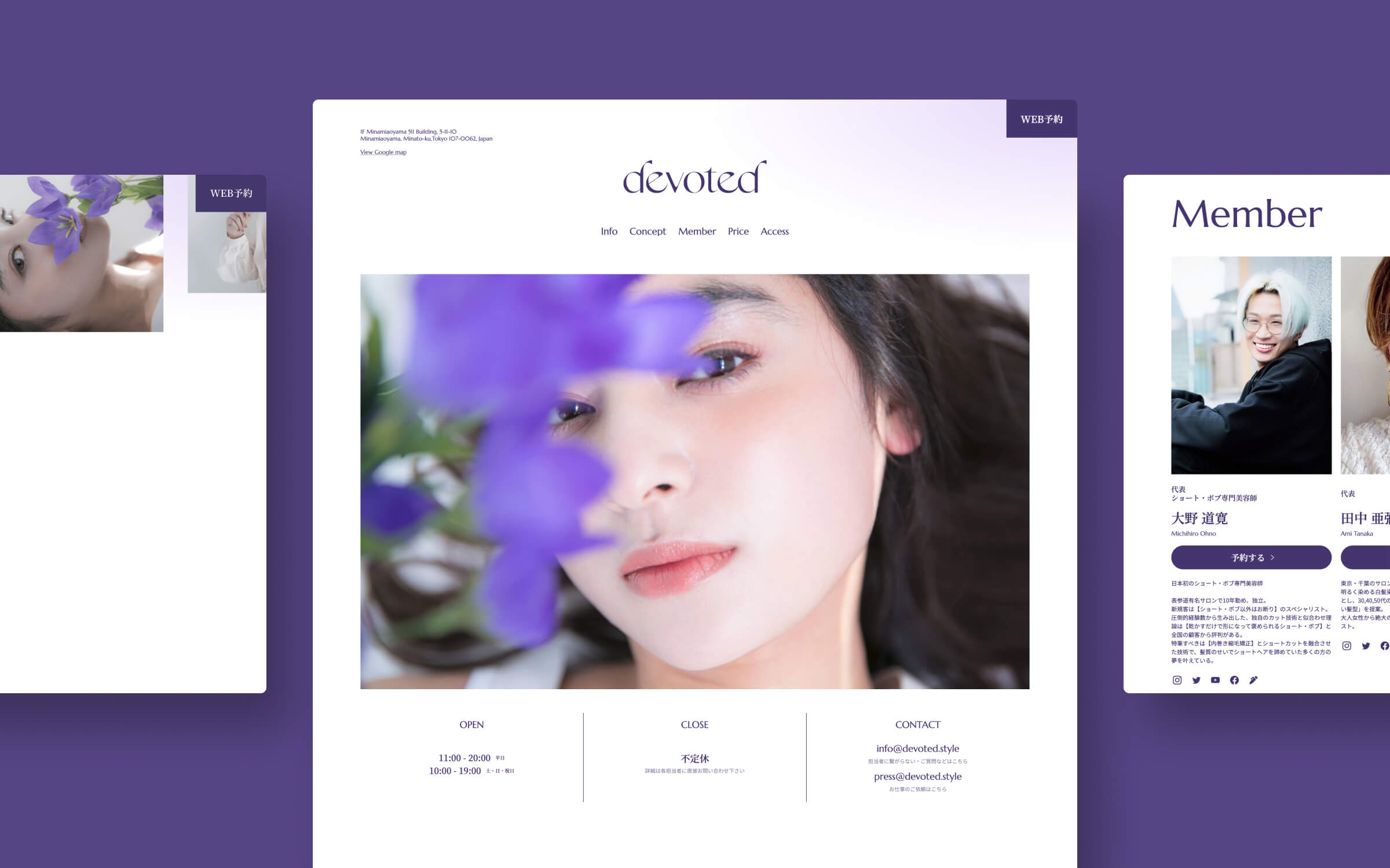
大野 道寛さん、田中 亜彌さんが代表を努め、Executive producerとして木村 直人さんを迎える新サロンブランド「devoted(ディブーティッド)」のBI・WEBデザインを担当させて頂きました。
Consistently and sincerely
I was in charge of BI and web design for a new salon brand "devoted", represented by Michihiro Ohno and Aya Tanaka, with Naoto Kimura as executive producer.


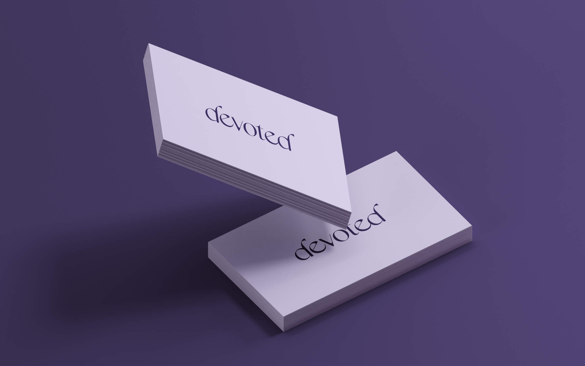
デザインするにあたり大切にしたのは「devoted」の意味でもある「一途」という言葉。これはサロンワークにおける美容師とお客様との関係性を表す言葉でもあり、ブランド自身の姿勢を表す為の大切な言葉でもあります。今回ブランドカラーとして採用している紫色は桔梗(キキョウ)の花の色からインスピレーションを受けたものですが、これは桔梗の花言葉である「誠実」「気品」と「一途」という言葉との親和性の高さによるものでもあります。
また、ロゴの造形に関してもどこか気品さを感じられるよう意識して制作しています。加えて、直接的な表現ではありませんが、「d」の造形については、遠くで桔梗の花が咲いているような様子をさりげなく遊び心として取り入れました。
The word "single-mindedness," which is also the meaning of "devoted," was important in the design process. This is a word that expresses the relationship between the hairdresser and the customer in salon work, and it is also an important word to express the brand's own attitude. The purple color used as the brand color this time was inspired by the color of the bellflower, which has a high affinity with the words "sincerity" and "elegance" in the language of bellflowers and the word "single-minded.
I also tried to create a logo with a sense of elegance. In addition, although it is not a direct expression, the shape of the "d" is a subtle play on the idea of a bellflower blooming in the distance.