SONY MUSIC
Sony Music Entertainment inc.
WEB SITE
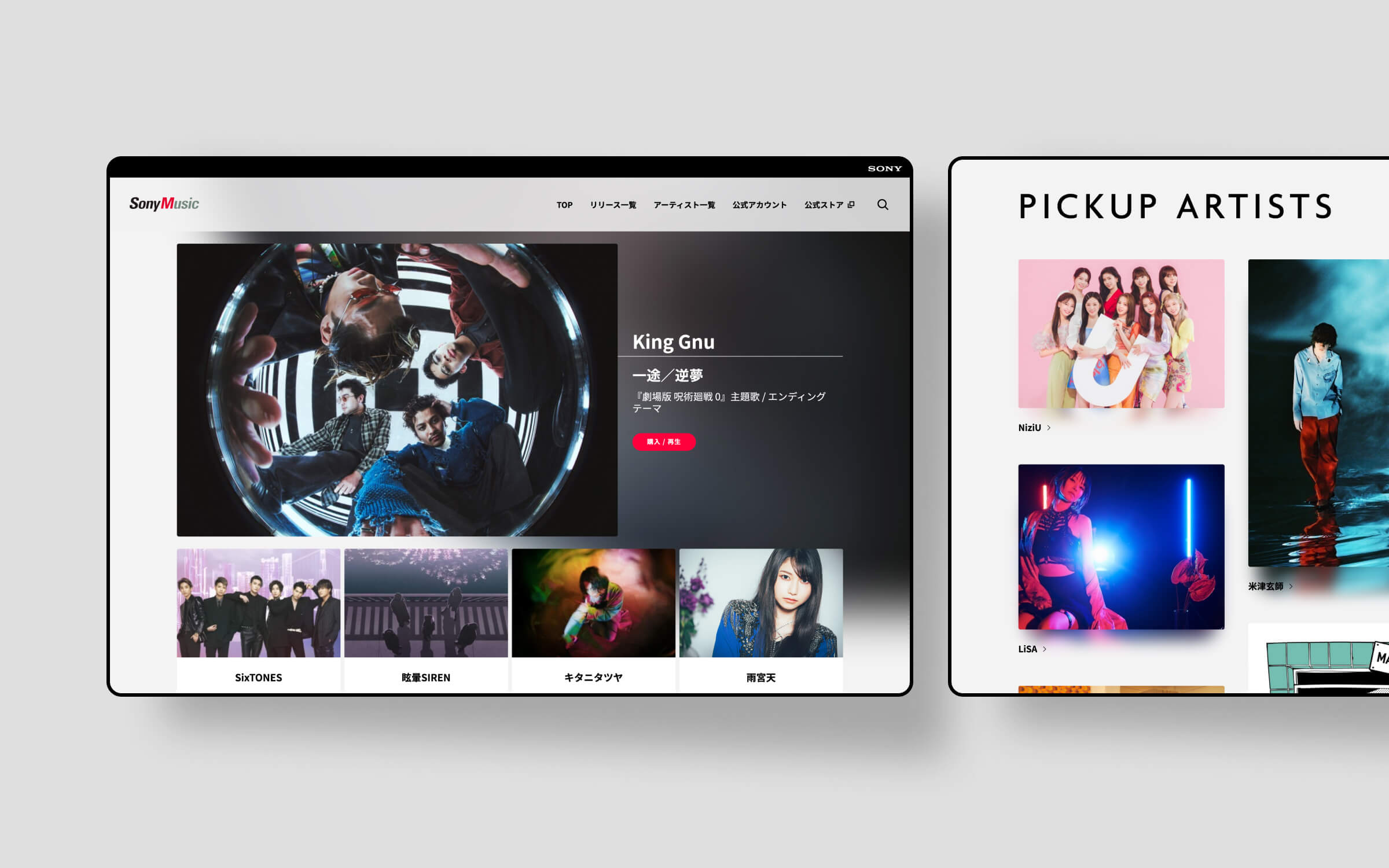
多様性と統一感
Sony Music レーベルサイトのフルリニューアルデザインを担当させて頂きました。リニューアルの大きな目的としてはスマホ観覧の重要性が増した現代において、より時代にあったUI、分かりやすいサイトへと改善する点などが挙げられます。
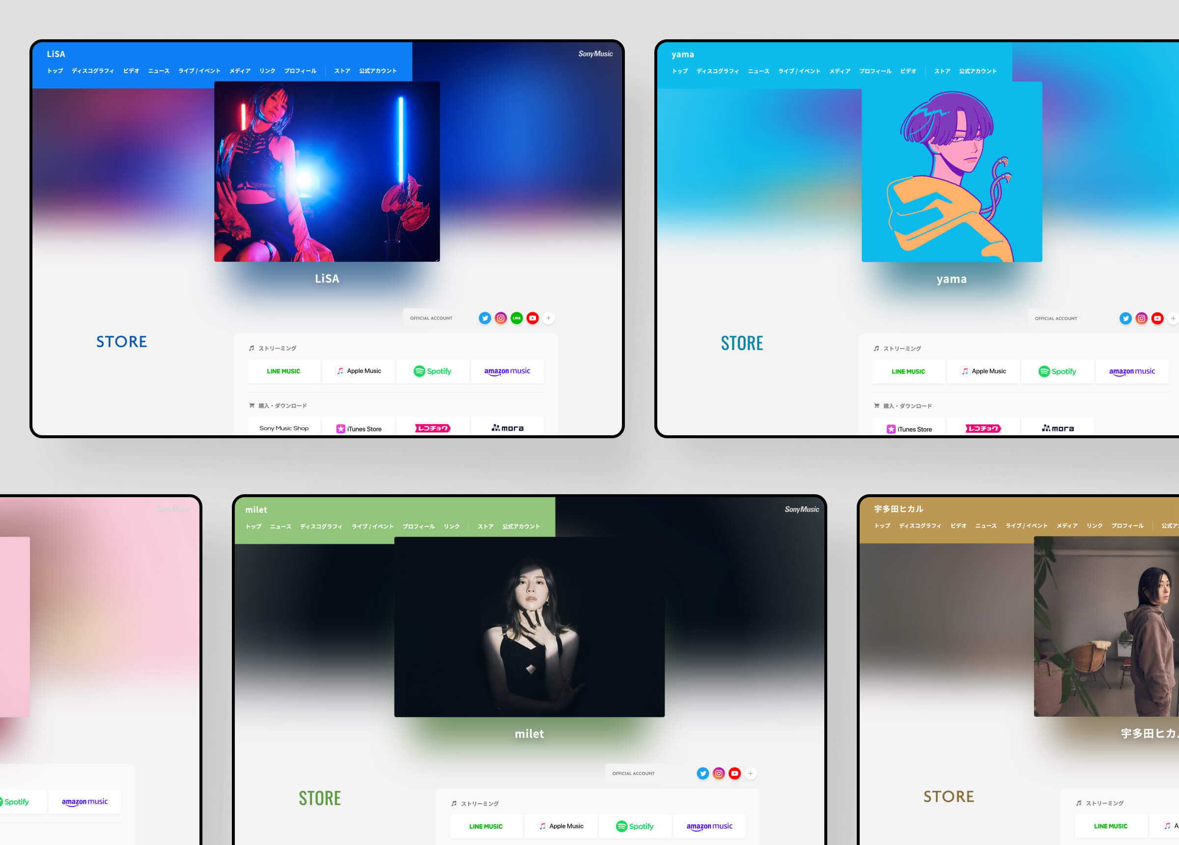
多くのアーティストが所属し、アーティストによっては公式サイトを別で持つ事も多い中、レーベルサイトにおいては同じ色、同じフォーマットに落とし込まれる事で、どうしても個性や世界観の差別化が難しく、つまらないものになってしまいがちです。そこで、今回のリニューアルでは登録されるアーティスト写真に合わせて、影や色を自動的に取得、反映させる事で、見やすいサイトではありつつもアーティスト毎でまったく違う世界観を見せてあげられるように工夫させて頂きました。
更新性、運用のしやすさは維持しながらもアーティスト毎の「色」を最大限感じ取ってもらえるように。多様性と統一感という相反する価値の両立を目指しました。
Diversity and Unity
We were in charge of the full renewal design of the Sony Music label website. The main purpose of the renewal was to improve the site's UI and make it easier to understand, given the increasing importance of smartphone viewing.
With so many artists belonging to the same label, it is difficult to differentiate their individuality and view of the world, and the site tends to be boring. Therefore, in this renewal, we have devised a way to automatically obtain and reflect shadows and colors according to the registered artist photos, so that each artist can show a completely different view of the world while the site is still easy to read.
We wanted to maximize the "color" of each artist while maintaining the ease of updating and operation. Our goal was to balance the conflicting values of diversity and unity.