SAKE TEA
LUDENS
BI / PACKAGING
情景が浮かぶ味
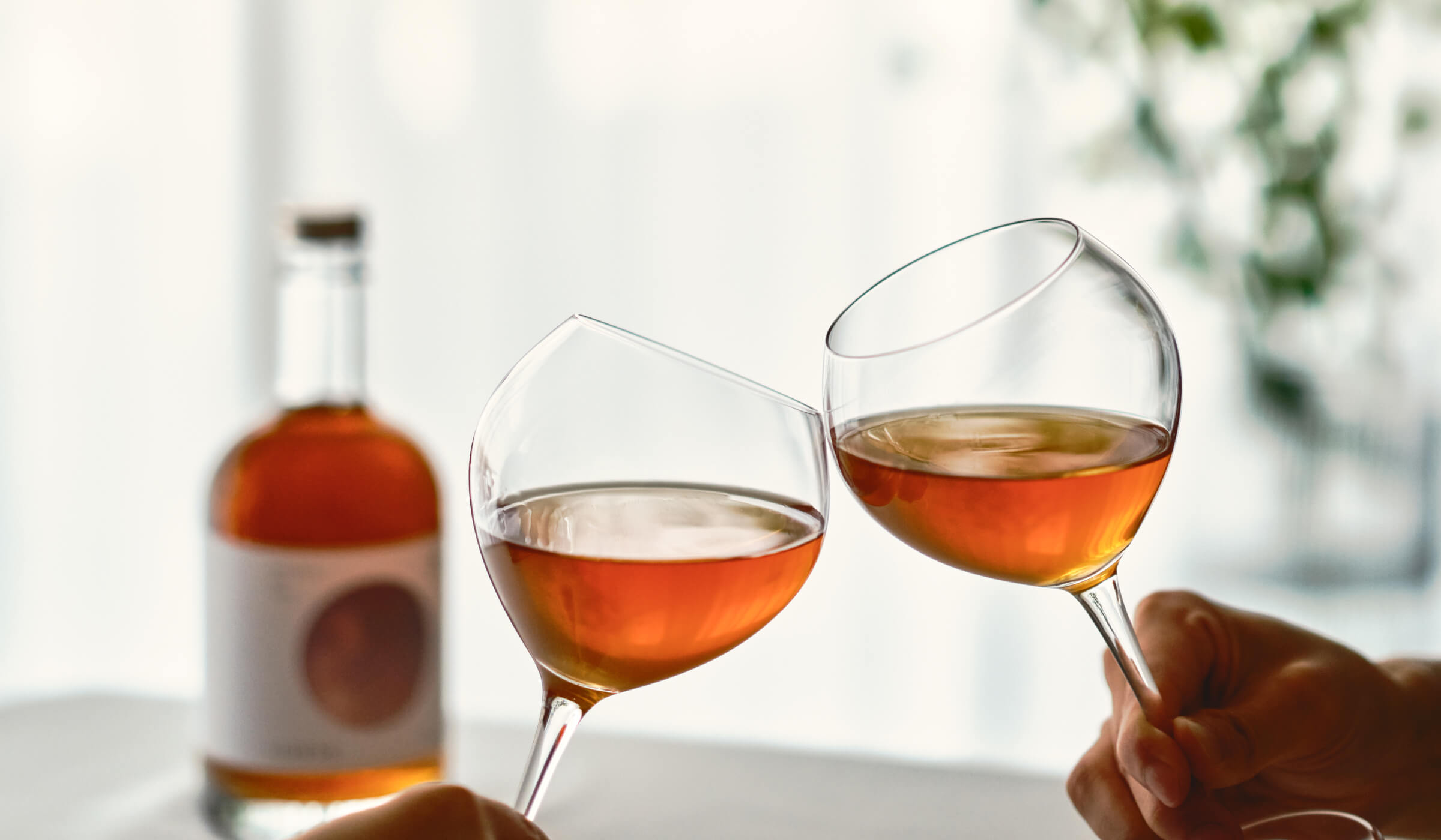
LUDENS(ルーデンス)株式会社が展開する、日本酒 x お茶を掛け合わせた新しいジャンルのお酒「SAKE TEA」ブランドのパッケージデザインを担当させて頂きました。LUDENS、そしてSAKE TEAは洗練されたアロマ、蜜や果物のような柔らかな甘味、穏やかなアルコールが、大切な人との特別な時間を彩る。そんなお酒をつくりたいという想いから産まれた会社でありブランドです。
A taste that brings a scene to mind
LUDENS Corporation has designed the packaging for the SAKE TEA brand, a new genre of alcoholic beverage that is a cross between sake and tea. The refined aroma, soft sweetness like honey and fruits, and mild alcohol will color your special time with your loved ones. LUDENS and SAKE TEA are a company and a brand born from the desire to create such alcoholic beverages.
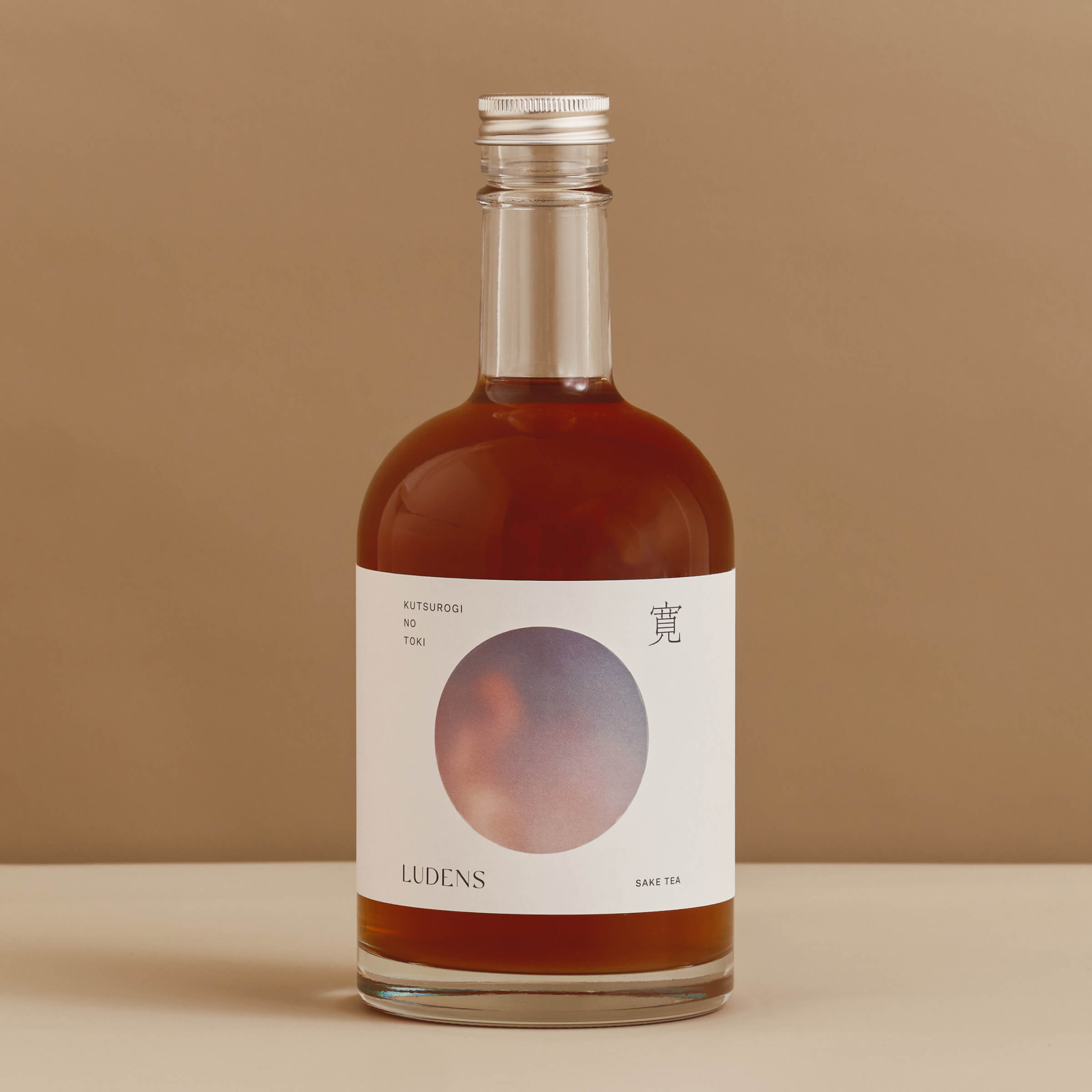
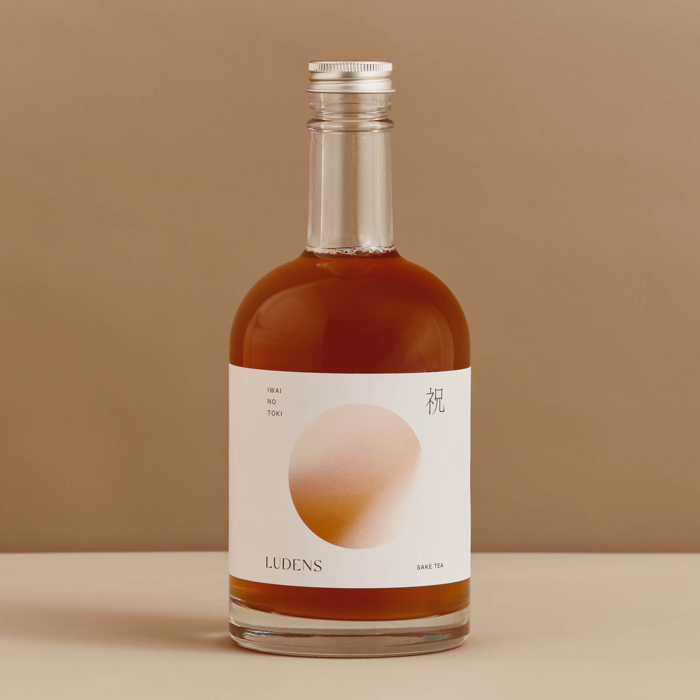
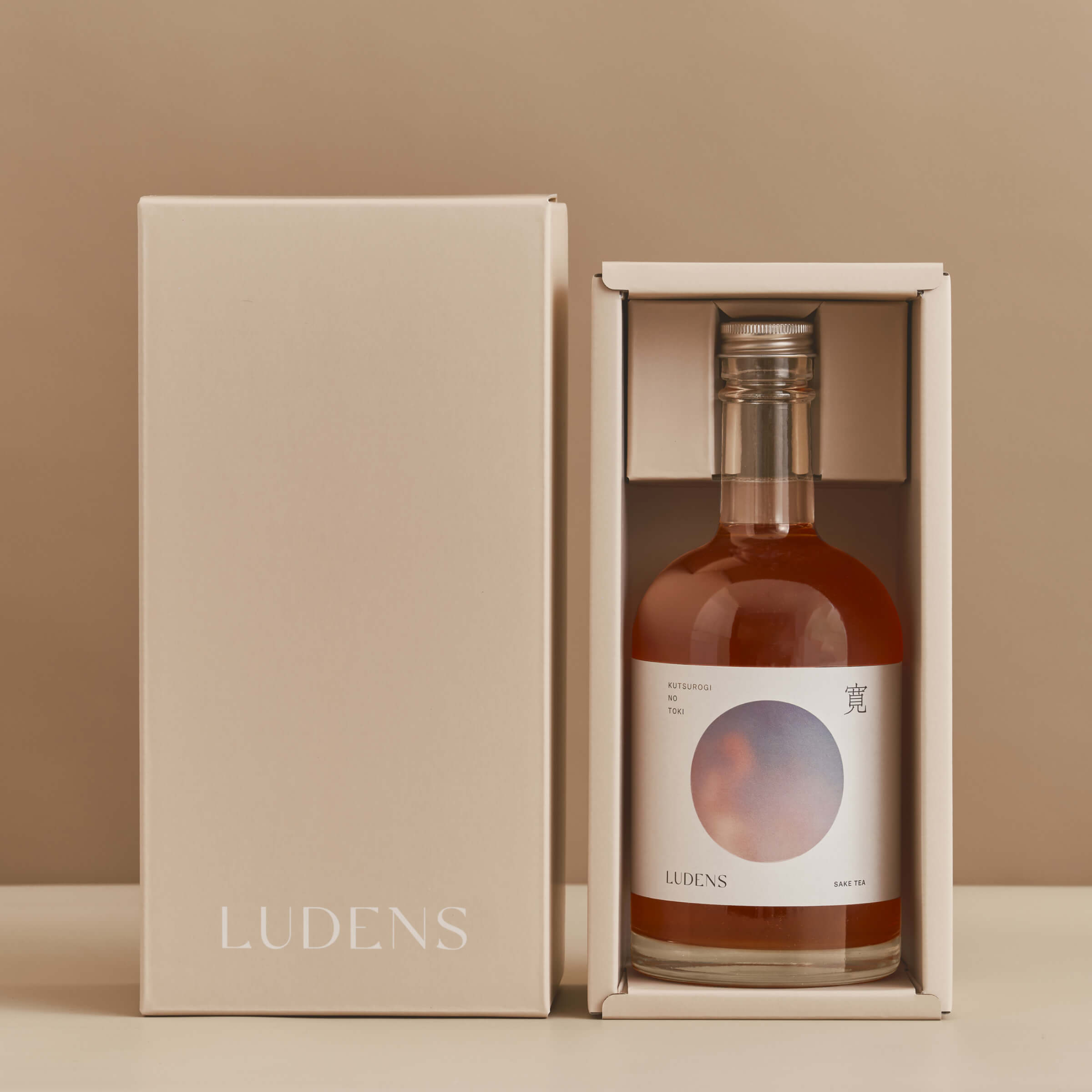
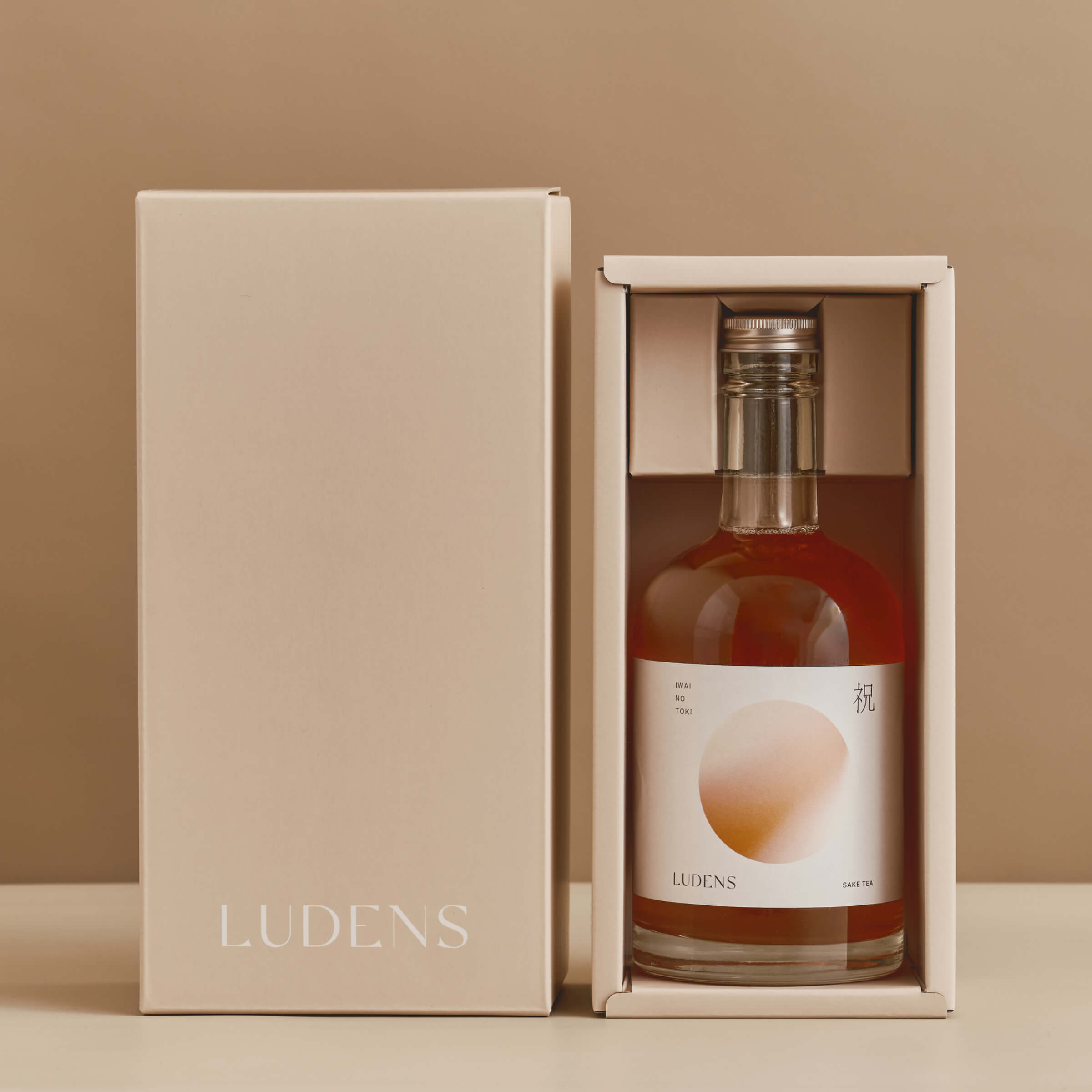
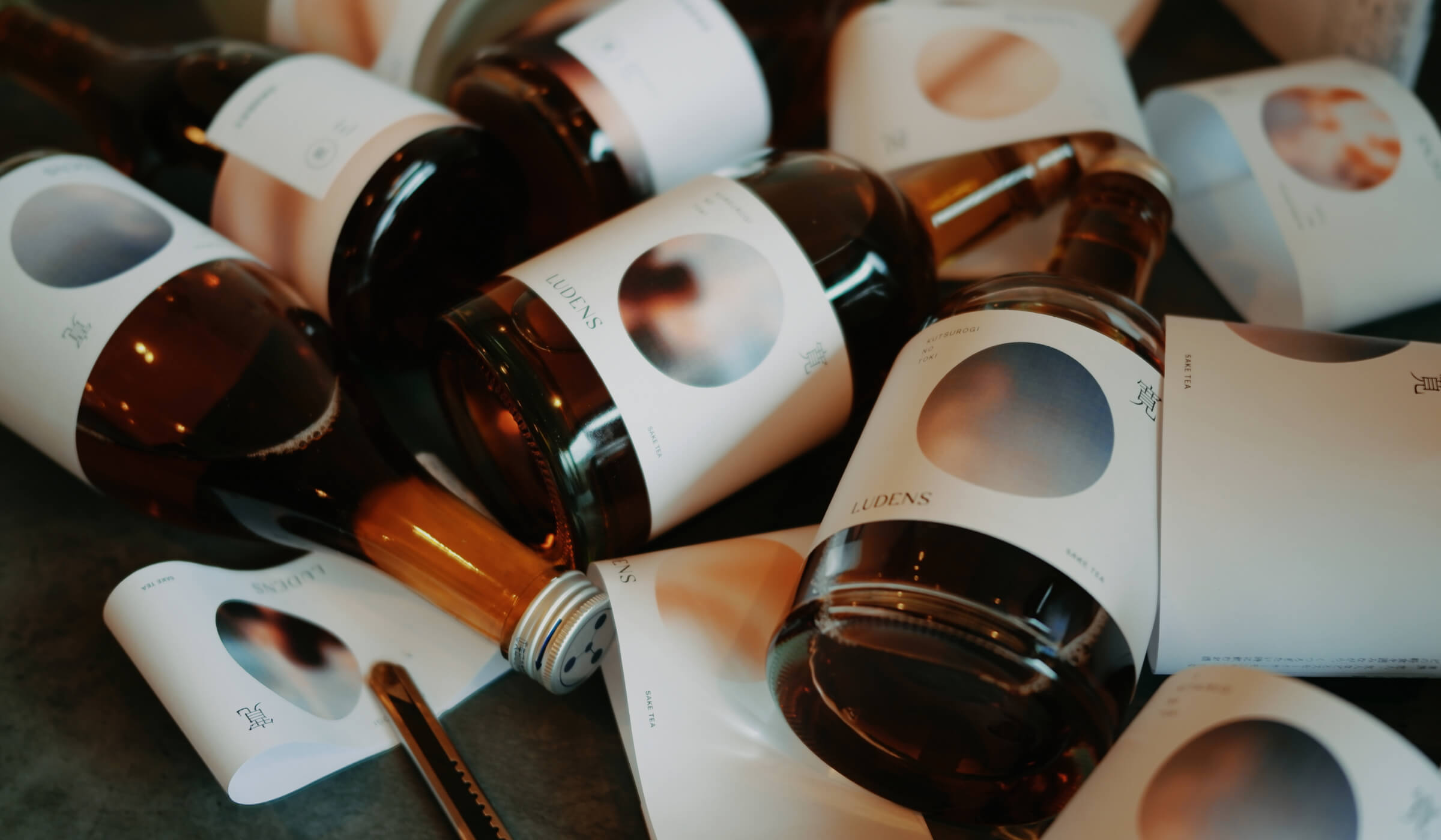
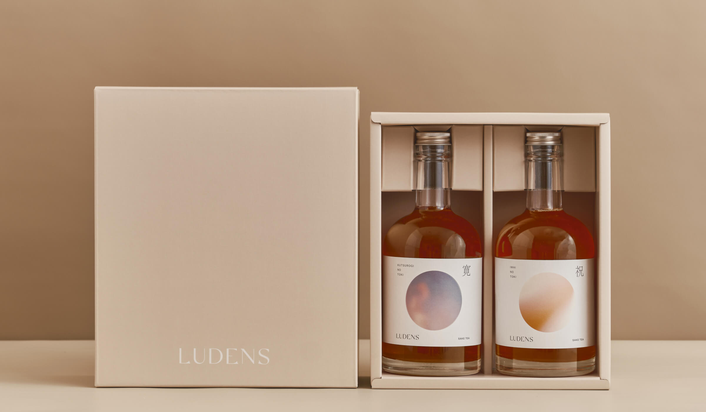
今回デザインさせて頂いた製品パッケージは「寛(くつろ)ぎの時」「祝いの時」の2銘柄。この2種類のお酒は、味・香りの違いがある事は勿論のこと、それぞれの名前が情景に繋がるテーマでもあります。
The product packages we designed this time are for two brands, "Kutsurogi no Toki" and "Celebration no Toki". The two types of sake not only differ in taste and aroma, but also in the theme of their names, which are connected to a scene.
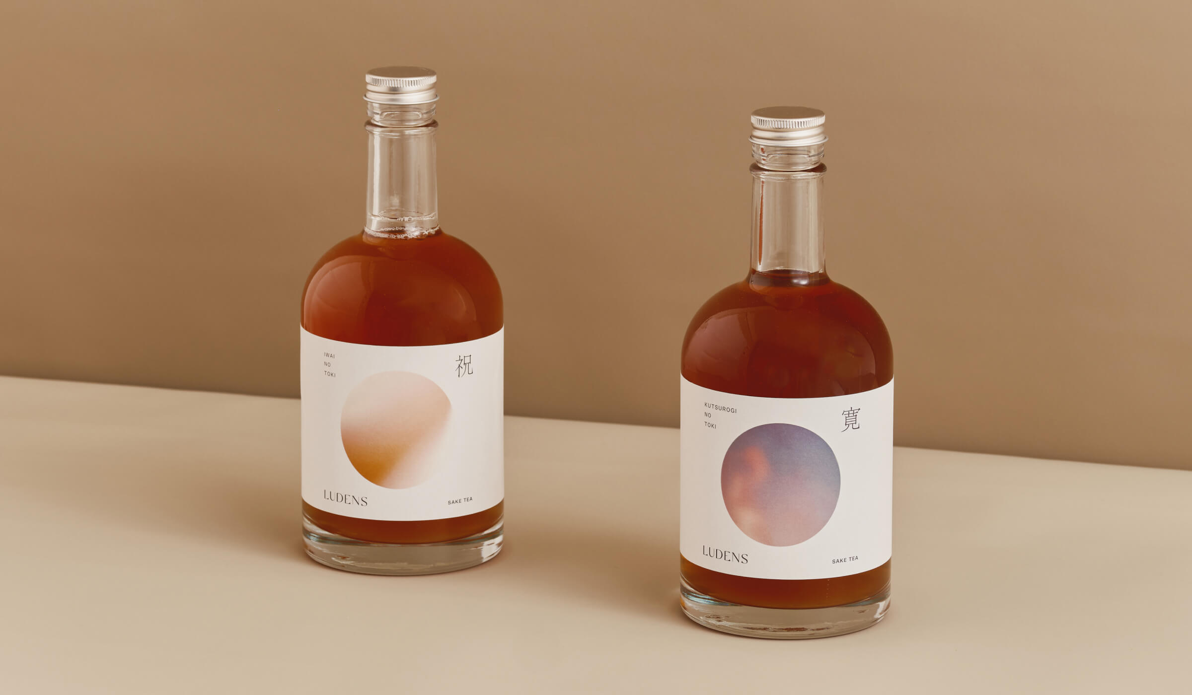
「寛ぎの時」は心落ち着く焚き火の香りがテーマのお酒。甘いロースト香や芳ばしい料理との相性の良さなど、ゆったりとした大人の時間を連想させるシーン(夜空と焚き火)を選定しています。そして「祝いの時」はその名前の通り、華やかなお祝いの花束の香り、そして甘さを感じさせるお酒。お祝いの場にふさわしいよう、光沢感・花びらの陰影を感じさせるシーンを選定しました。
加えてブランド共通の方向性としては、日本酒(和)と紅茶(洋)という異なる個性のMIX、という視点も強く意識されています。ボトル形状やエディトリアルは洋風でミニマルでありつつ、円で構成された写真、特徴的な1文字の漢字など、和を感じる要素も残す。組み合わせ、削ぎ落とすことで生まれる新しい価値の創造を目指しました。
The theme of the "Time of Relaxation" sakes is the calming aroma of a bonfire. It was selected for its sweet roasted aroma and its compatibility with aromatic food, a scene (night sky and bonfire) that evokes a relaxing adult time. And "Celebration Time," as its name suggests, is a sake with the aroma of a gorgeous bouquet of festive flowers and a touch of sweetness. We selected scenes that evoke a sense of luster and the shadows of petals to make it appropriate for festive occasions.
In addition, the common direction of the brand is a strong awareness of the mixing of the different characteristics of sake (Japanese) and tea (Western). While the bottle shape and editorial are Western-style and minimalistic, elements that convey a sense of harmony are also retained, such as the photograph composed of circles and the distinctive single kanji character. We aimed to create new value created by combining and cutting down.