SAKELIFE
abchu
BI
さり気ない日本らしさ
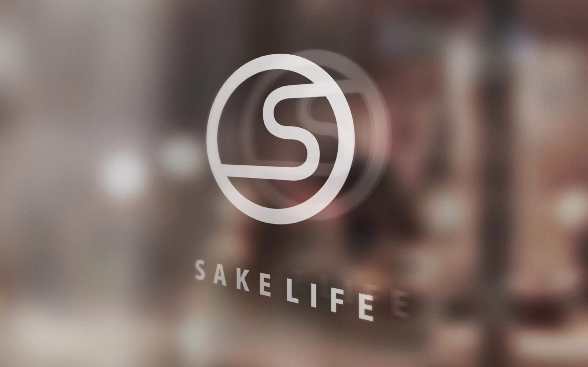
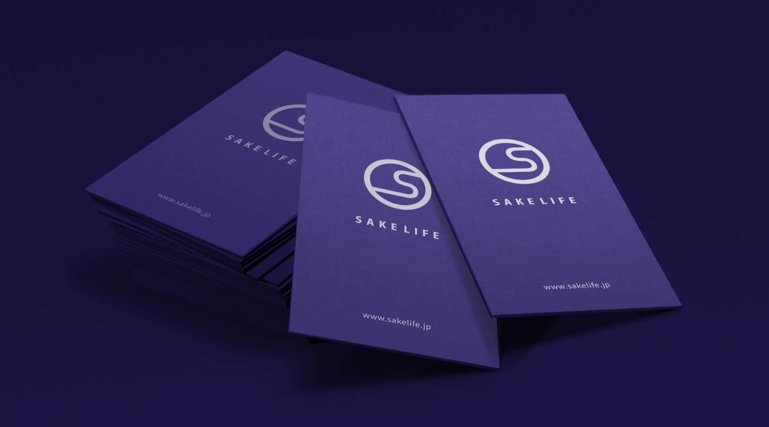
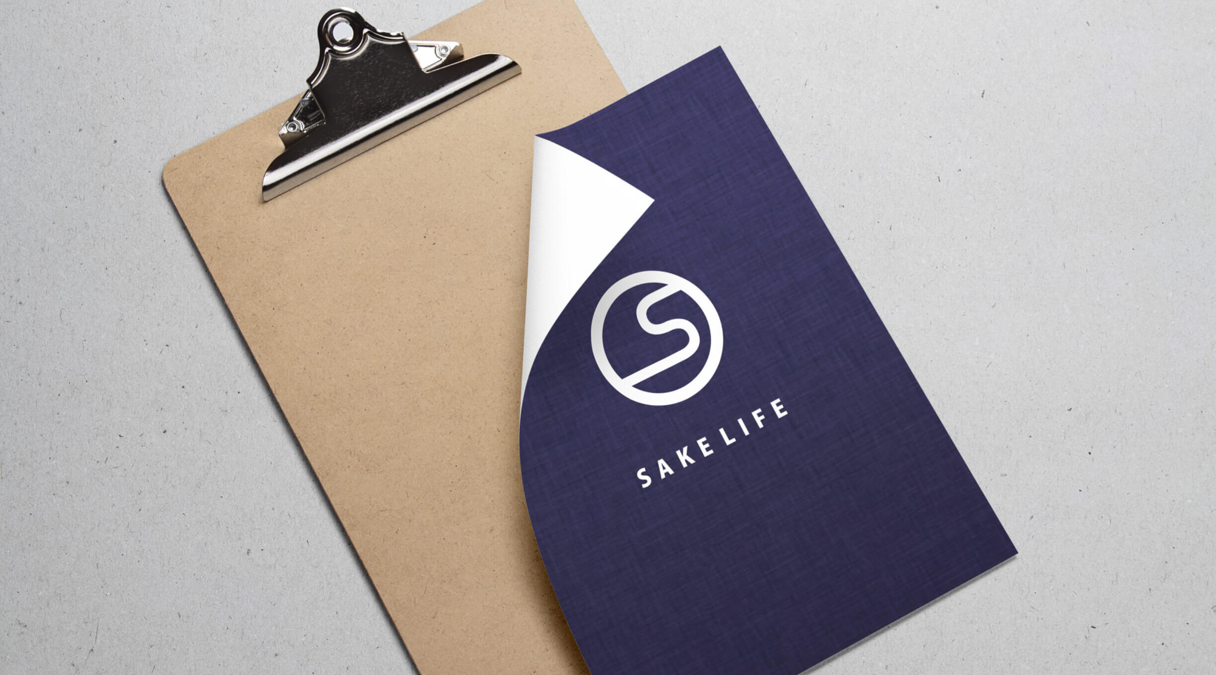
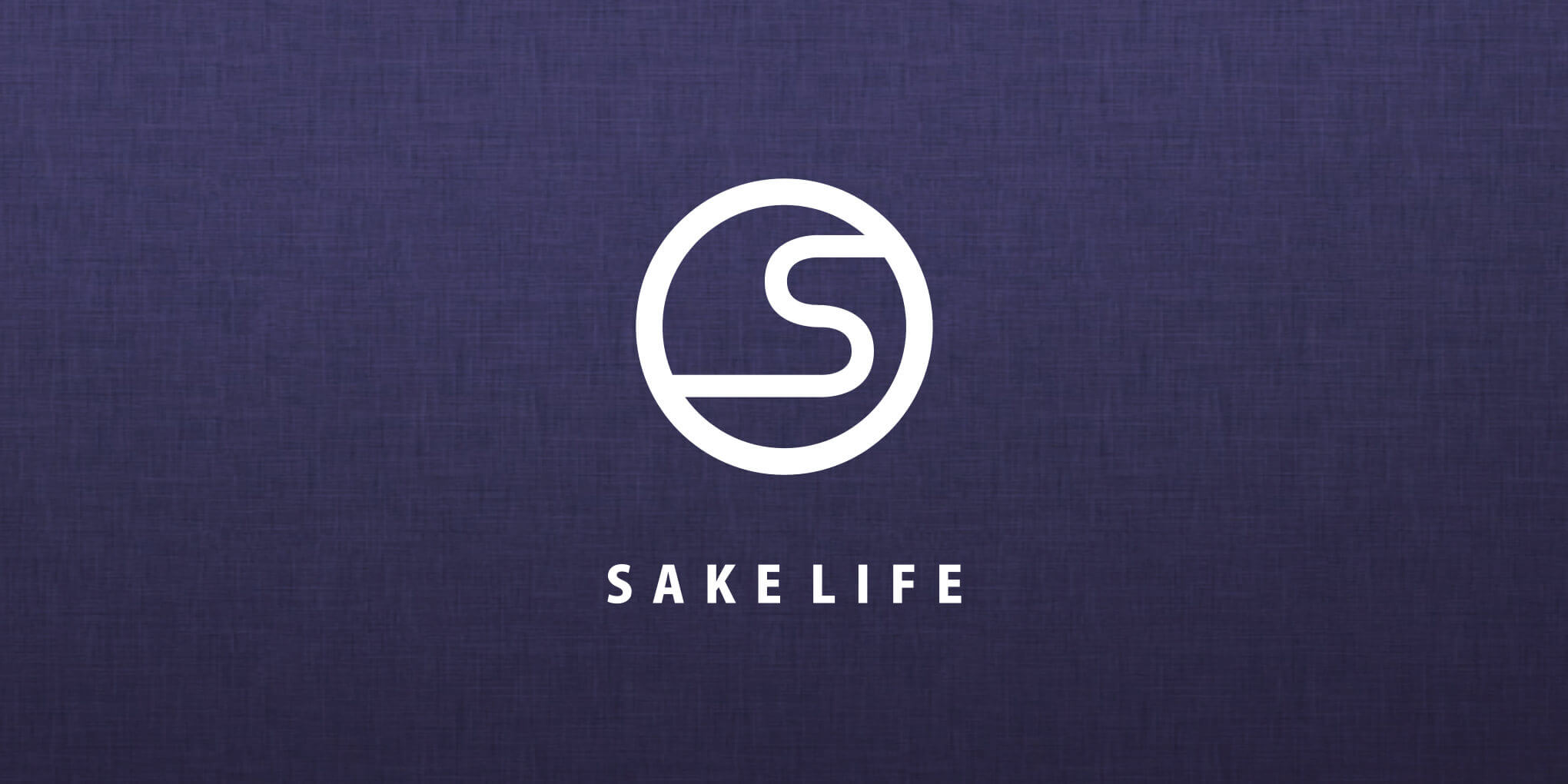
日本酒の定期購入サービス「SAKELIFE」のロゴデザインをさせて頂きました。
このサービスで大きなテーマだったのは、日本酒に普段触れる機会が少なく苦手意識を持つ若者に如何にして、日本酒に触れる機会を増やし、好きになってもらうか、という事。このテーマを踏まえ、実際にデザインする上で注力したのは若者に受け入れられる”さりげない日本・日本酒らしさ”でした。
日本酒から連想されやすいアウトプットのイメージは漢字や毛筆書体ですが、今回のデザインでは敢えてそれらを用いず、第一印象では日本酒サービスのロゴだと感じさせないように意識しています。一見するとSAKELIFEの頭文字のSのマークのように感じますが、それだけではなくおちょこに淹れたお酒の揺らぎや、古くから日本の紋様として利用された雲形など取り入れるなど「日本酒」と「日本」を抽象化した要素が融合されています。
Japanese character
We designed the logo for "SAKELIFE", a Japanese sake subscription service.
The main theme of this service was to increase the number of opportunities for young people to experience and enjoy sake and to encourage them to become fans of it, as they are not likely to have a chance to do so. With this theme in mind, we focused on designing a service with a "subtle Japanese character" that would be acceptable to young people.
The output that is most likely to be associated with sake is Chinese characters and calligraphy, but in this design, we intentionally avoided using them in order not to give the impression that the logo is for a sake service at first glance. At first glance, it looks like the "S" in the initials of "SAKELIFE", but it's not just that, it's a combination of elements that abstract the "sake" and "Japan", such as the swaying of the sake brewed in the cup and the cloud shape, which has been used as a Japanese pattern since ancient times.
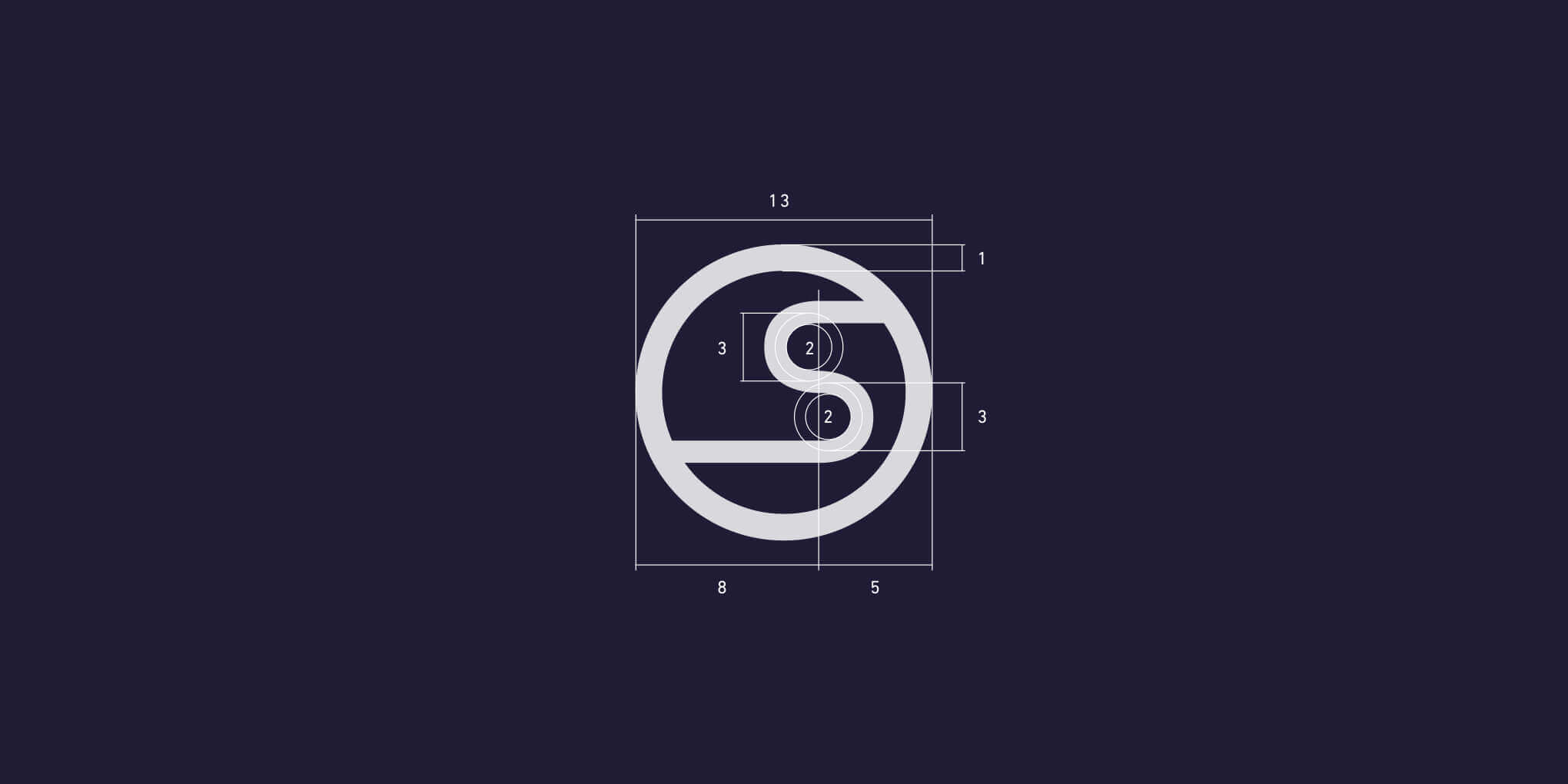


LOGOTYPE / BASE
Kozuka Gothic Pro - Heavy

TEXT
Kozuka Gothic Pro - Regular