NANAYON
nanayon
CI
調和
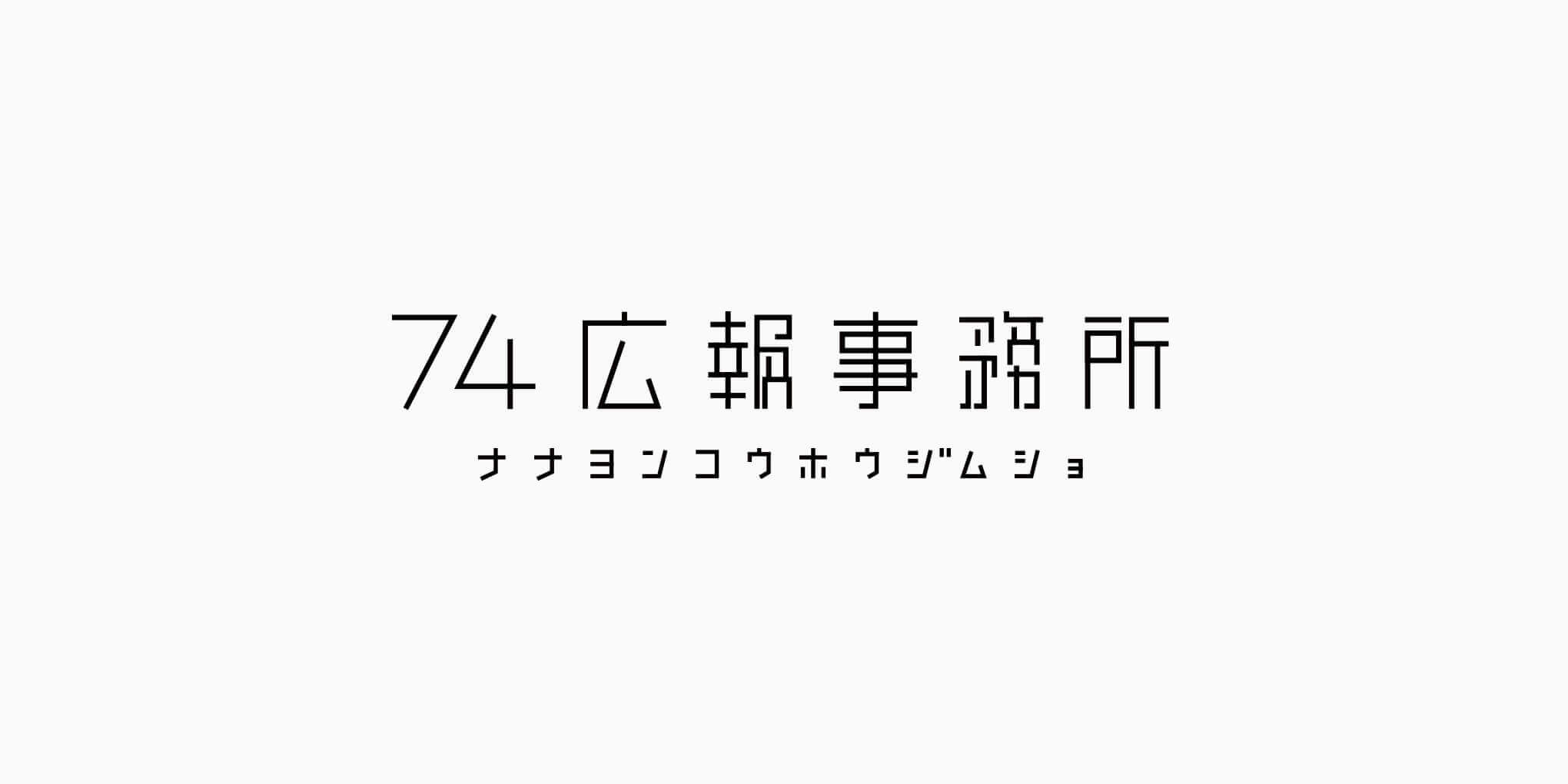
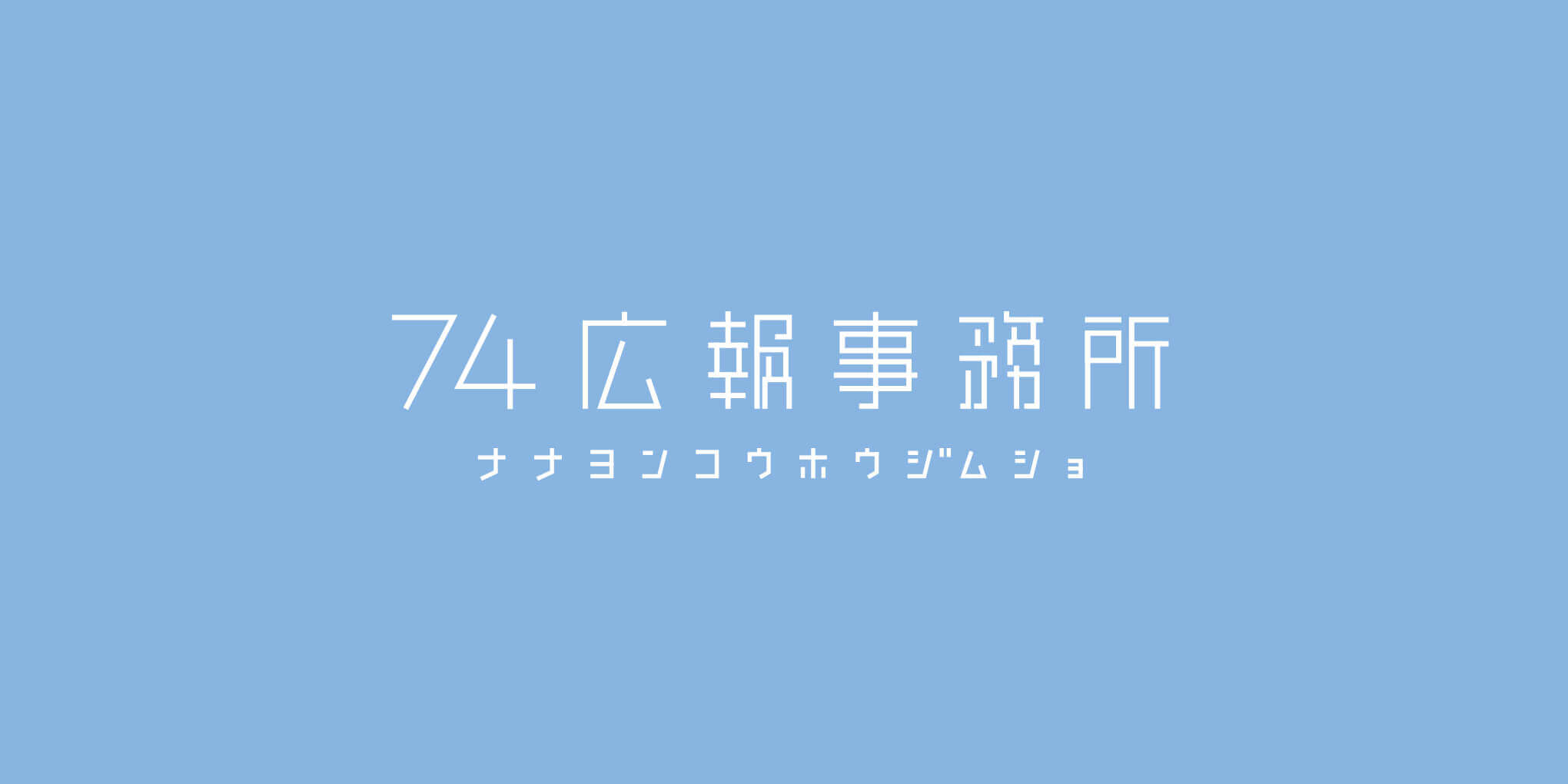
スタートアップ企業や広報部門を持たない企業のコンサルティング、広報部門の立ち上げなどを請け負う会社、ナナヨン広報事務所のコーポレートロゴデザインをさせて頂きました。
この社会には様々な企業がありますが、常に好調な企業などなく、時として不調な事もあります。好調な時だけでなく、不調な時をいかに頑張れるかが重要です。企業名であるナナヨン(74)には、良い時(7)も悪い時(4)も、攻め(7)も守り(4)も、その対極にあるモノどちらも重要で、その両方で力になることが出来る、という意味が込められています。
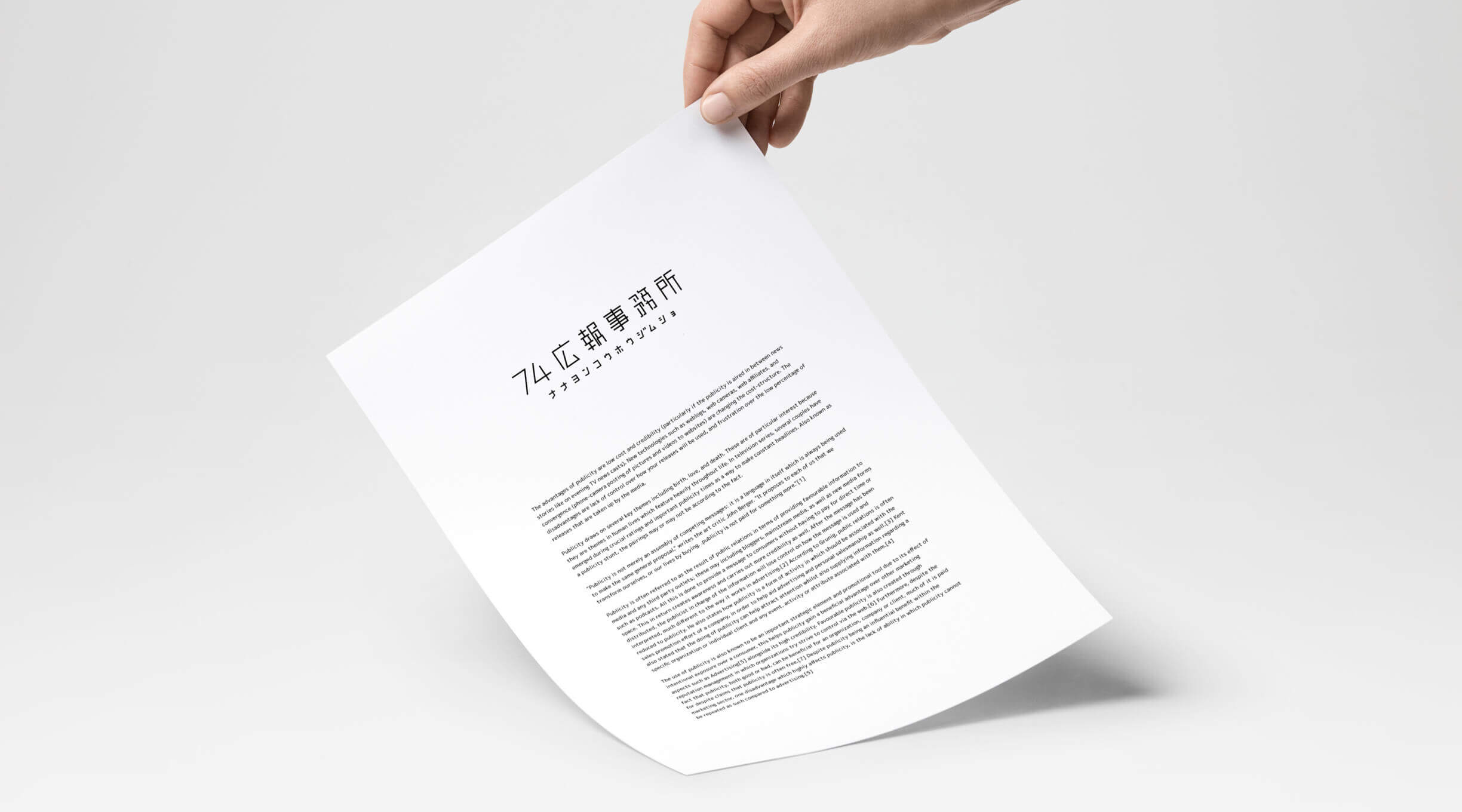
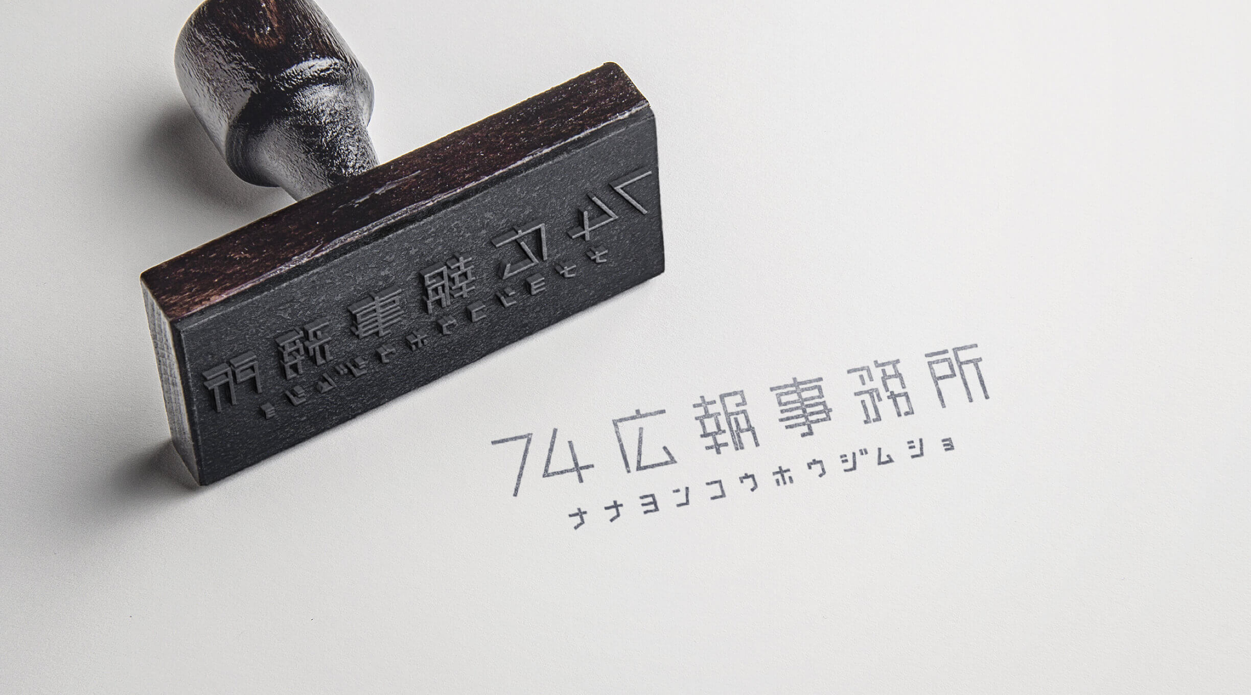
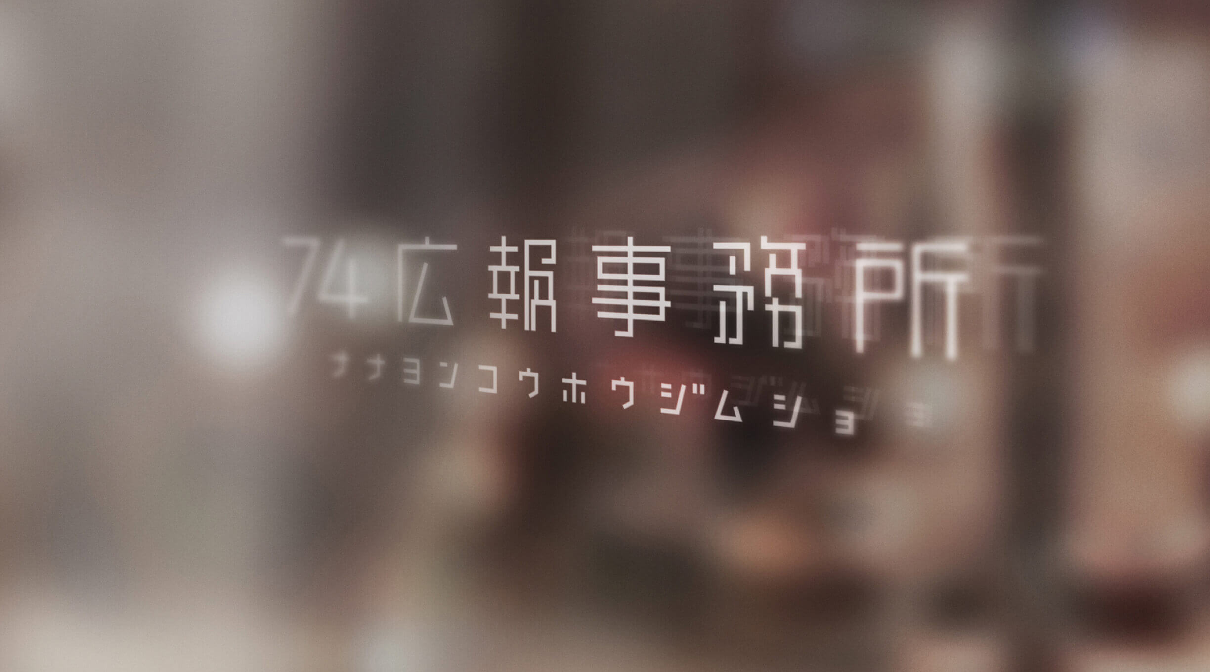
ロゴデザインでは対極にあるものをまとめるという点から「調和」をひとつのテーマとし、74という「数字」、広報事務所という「漢字」、その企業名のフリガナである「カタカナ」、それを同じ太さ、同じテイストでまとめあげました。また、漢字で広報事務所と書くと少し堅苦しく距離を感じさせてしまう為、あえて字体は崩し、より親近感が持てるデザインを目指しました。
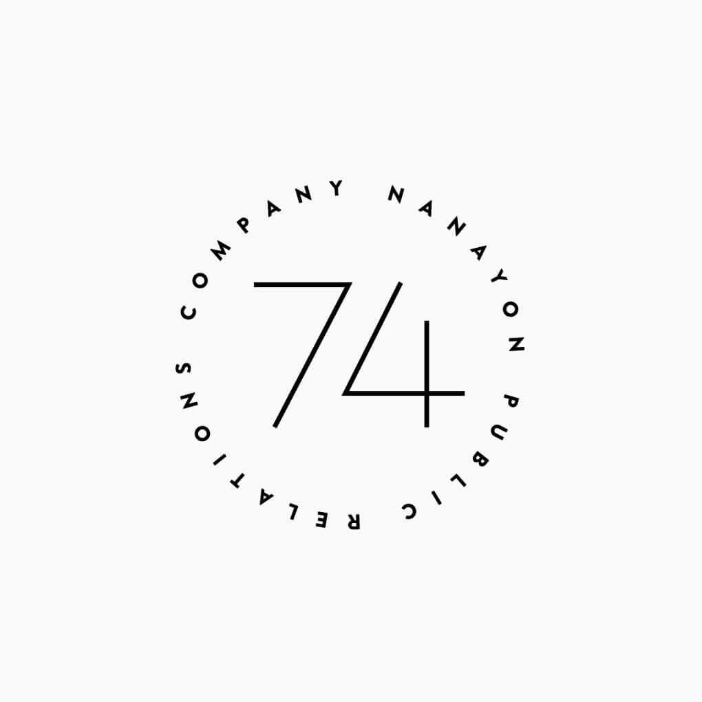
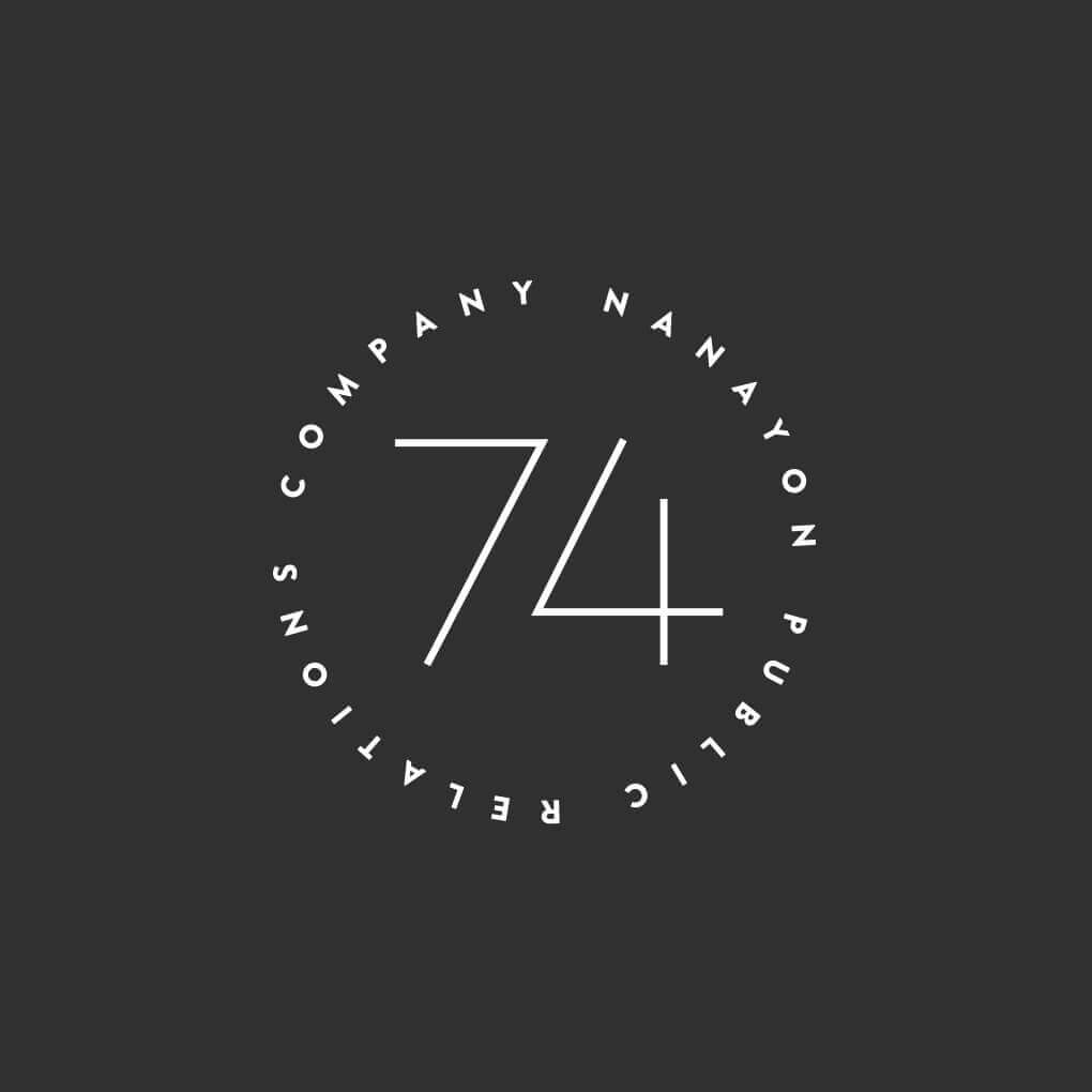
Harmony
We designed the corporate logo for Nanaillon Public Relations Office, a consulting and public relations firm for start-ups and companies that do not have a public relations department.
In this society, there are many different types of companies, but none of them are doing well all the time, and sometimes they are not doing well. It is important to do your best not only in the good times but also in the bad times. Our company name, Nanayon (74), has the meaning that both good times (7) and bad times (4), offensive (7) and defensive (4), as well as their opposites, are important and that we can be a source of strength in both.
The number 74, the Chinese character for public relations firm, and the katakana, the frigativeness of the company's name, are all in the same thickness and taste. Writing the word "public relations office" in Chinese characters would make it seem a bit stiff and distant, so we intentionally changed the font to make the design look more approachable.