MUKURI
mukuri inc.
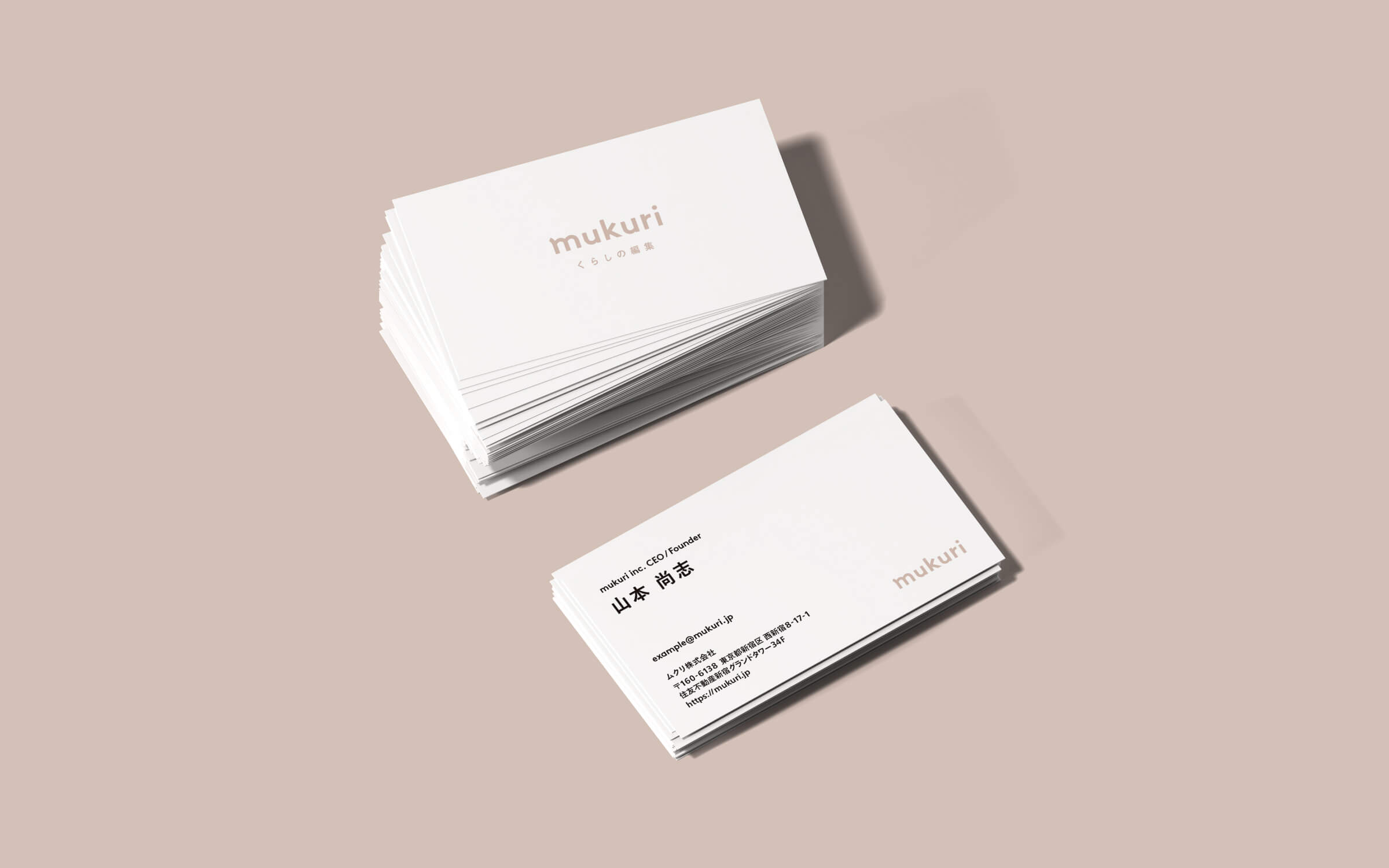
BI
強く根付き、無垢に育つ
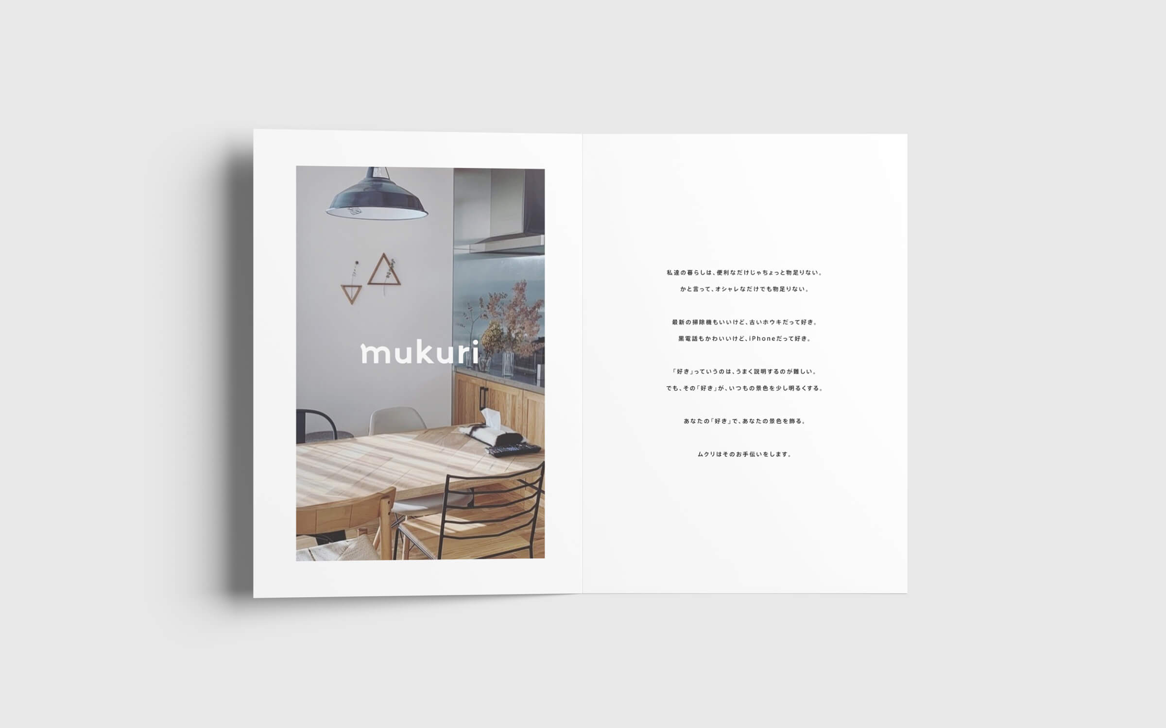
「家事」「インテリア」「収納」「食」などの暮らしに関わるアイディアを集めるメディア「ムクリ」のBIデザインを担当させて頂きました。
具体的なモチーフは用いていませんが、文字の成り立ちとして、木の成長をメタファーにしたデザインコンセプトになります。 地面 ( 下部 ) に面した要素はソリッドな形状で、要素の先端に近い部分は丸みを帯びた印象になっています。よく 見ると高さも文字それぞれでばらばらで、どこか柔らかさや隙を感じさせますが、ベースラインはきれいに揃って いるので、ぱっと見た印象からは無秩序さは感じさせません。相反する要素が混在しています。
Strongly rooted and growing immaculately
I was in charge of BI design for "Mukuri", a media that collects ideas related to daily life such as housework, interior design, storage, and food.
Although no specific motif is used, the design concept is based on the metaphor of a growing tree. The elements facing the ground (bottom) have a solid shape, while the parts near the tips of the elements have a rounded look. If you look closely, you can see that the height of each letter is different, which gives a sense of softness or lack of space, but the baseline is neatly aligned, so you don't get the impression of disorder from a quick glance. The height of each letter is different, giving the impression of softness and gaps.

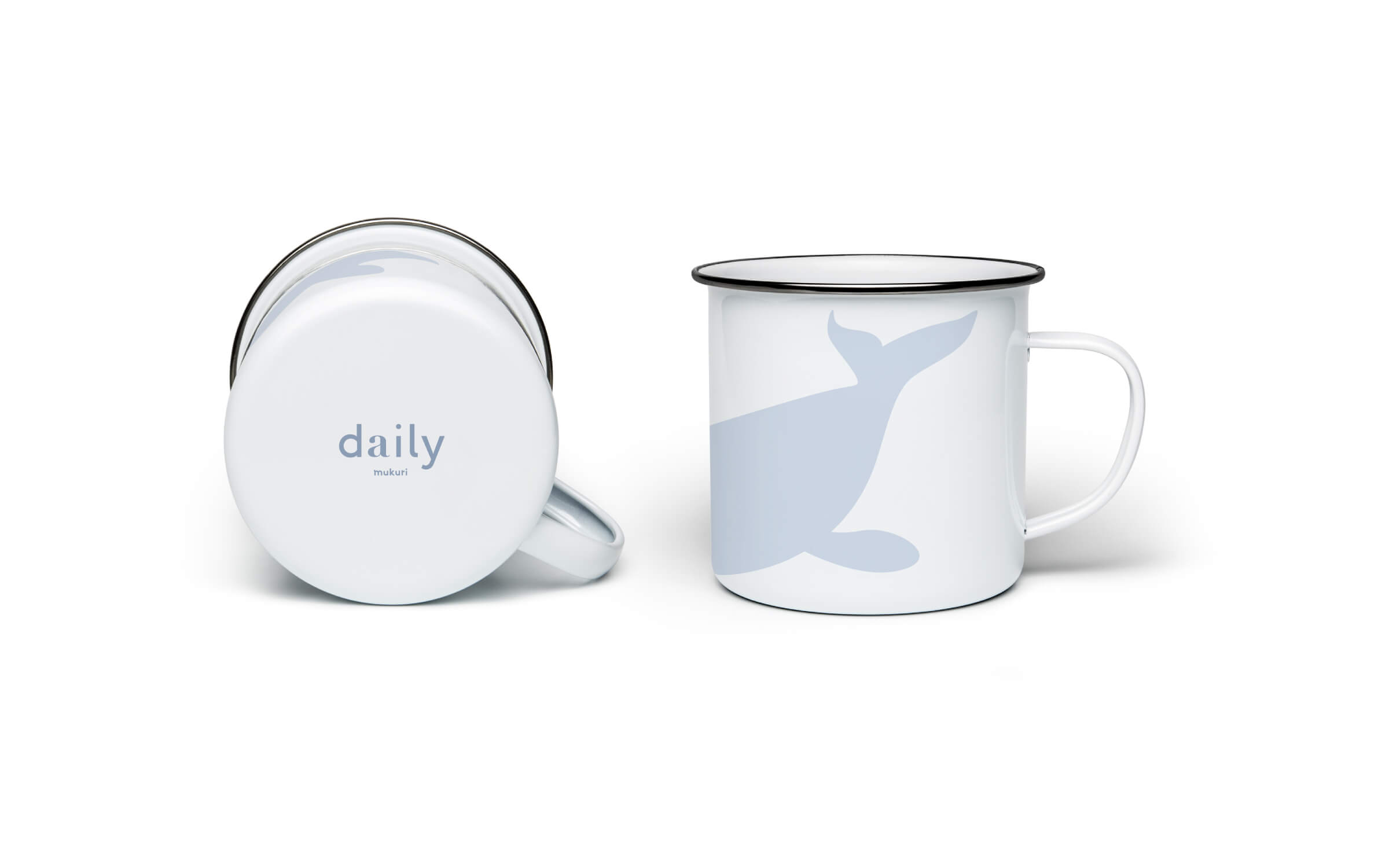
また、BIデザインと共にムクリのオリジナルブランドである「daily」 のロゴも同じくデザインさせて頂きました。このブランドは日常生活に溶け込む質の高い製品の提供を大きなテーマとしています。
決して特別な製品というわけではなく、日常生活で使ってもらいたいという気持ちを込めたブランド名。 基本的なフォントは一般的なスラブ書体を使いながらも”A” の部分だけ高級感のあるセリフを採用しています。 あくまで日常生活の中で使う製品ではあるけれど、品質の高い A ランクの製品であることを示唆しています。
In addition to the BI design, we also designed the logo for Mukuri's original brand, "daily". The main theme of this brand is to provide high quality products that fit into our daily lives.
It is not a special product by any means, but a brand name that expresses the desire for people to use it in their daily lives. The basic font is a standard slab typeface, but the "A" part uses a high quality serif. It suggests that the product is a high quality A-rank product, even though it is used in daily life.