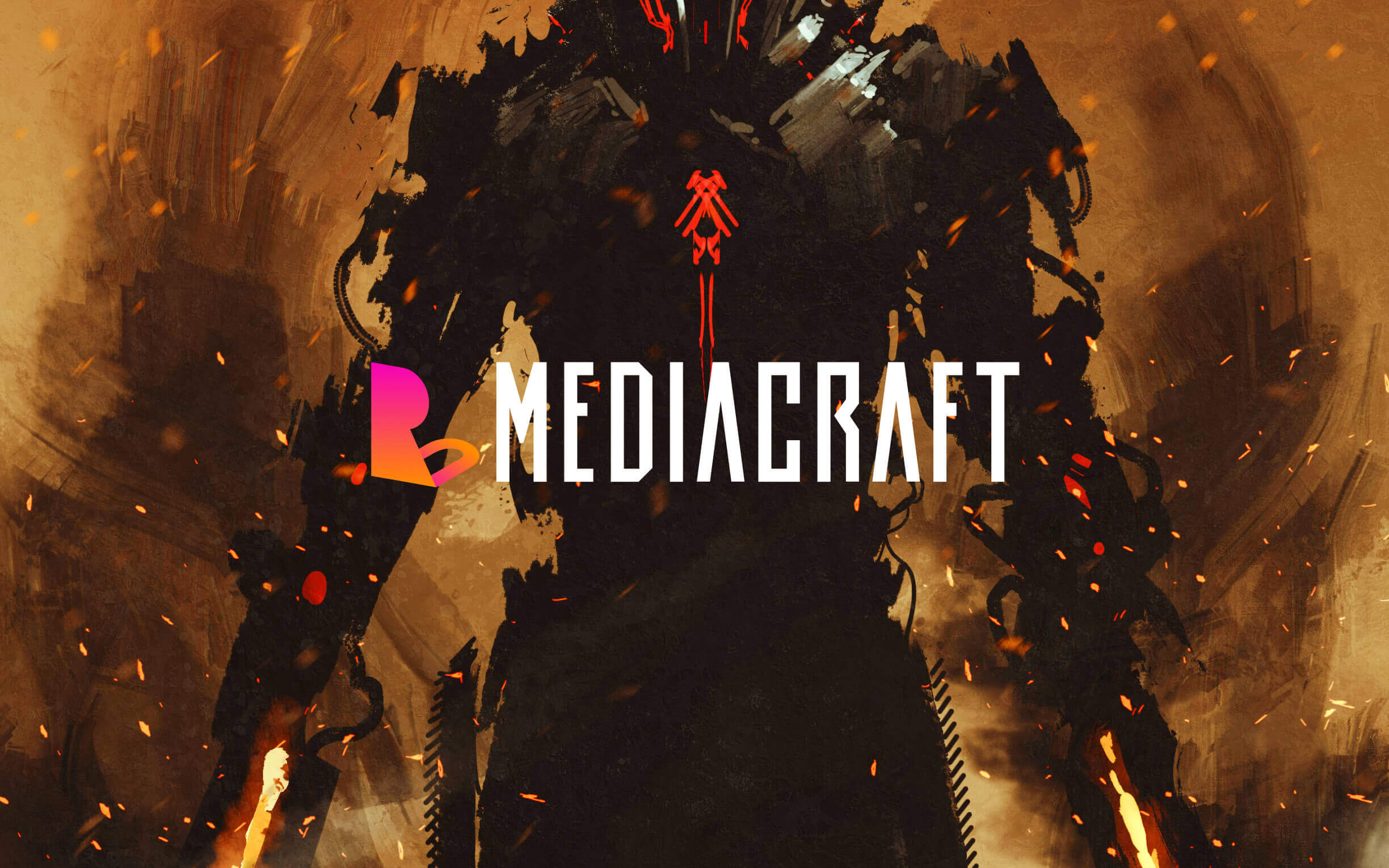
ROCKU MEDIACRAFT
Unicon Pte Ltd.
BI / WEB SITE
PLAYFUL
株式会社ユニコンが運営するゲーマー向けキュレーションメディア「RockU Mediacraft」のロゴ、サイトデザインをさせて頂きました。ゲームを扱うメディアだからこそ、ゲームらしさやちょっとした遊び心を大切にしています。
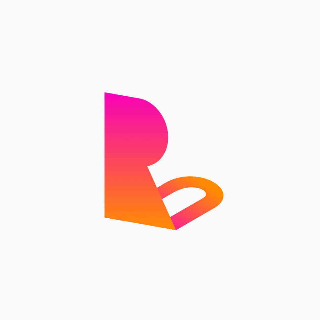
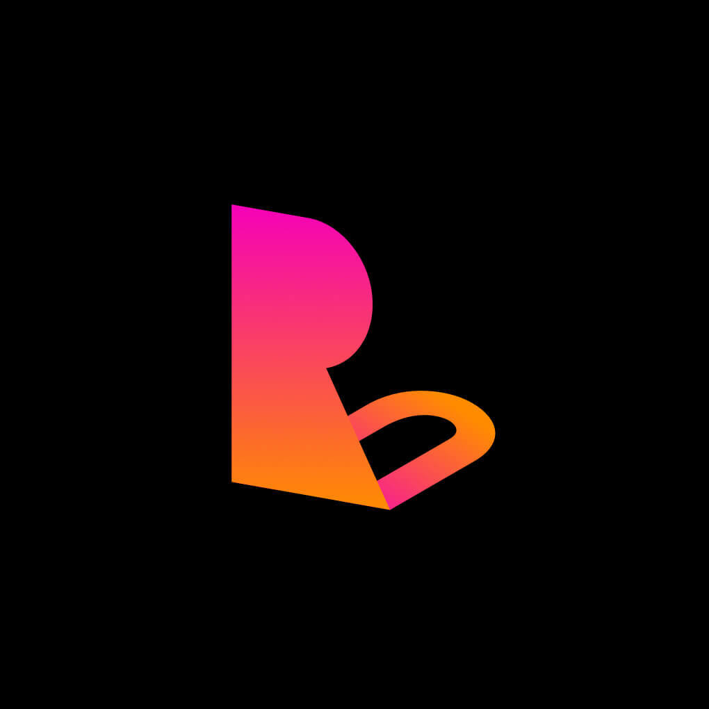
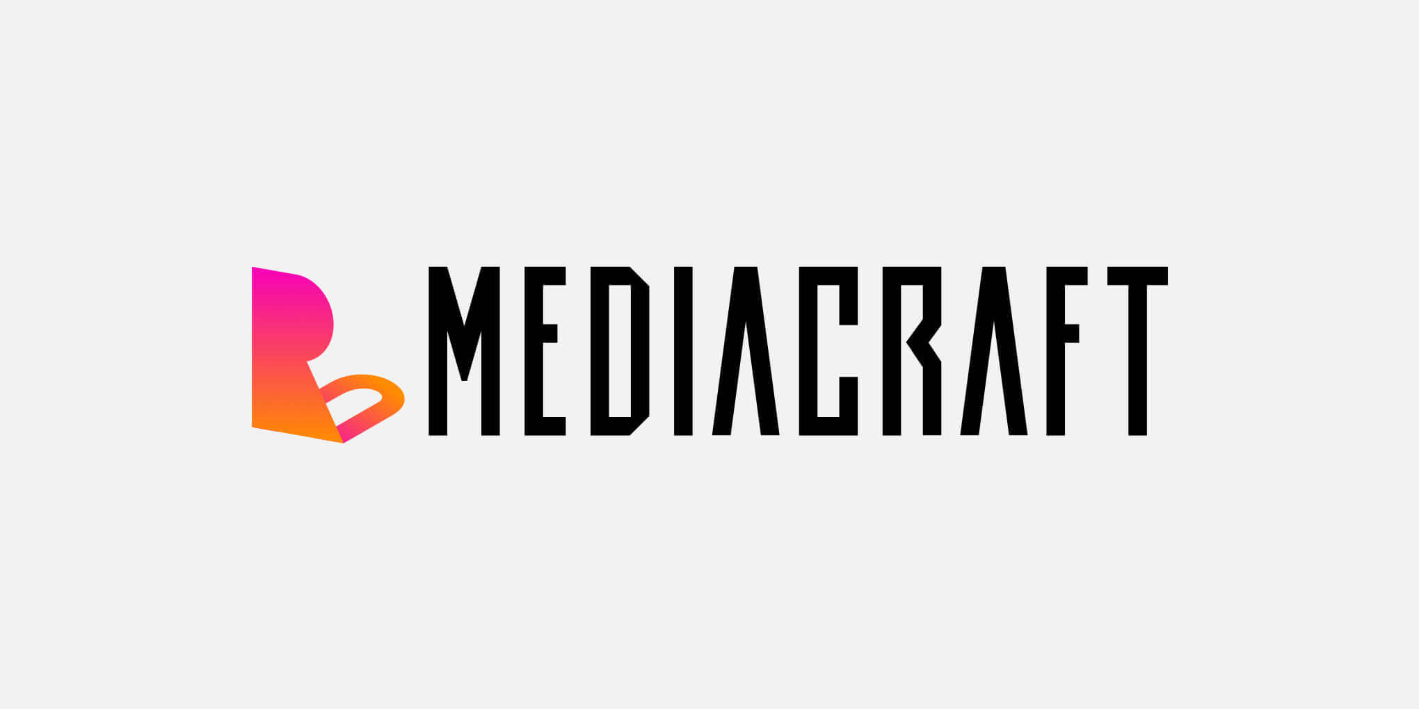
ロゴマークはRockUの頭文字"R"と"U"を抽象化し、立体的に組み合わせた形状になっています。今後派生サービスがリリースされた際に、同じブランドサービスである事が示せるように単体でも組み合わせでも使いやすいように意識して制作されました。ロゴタイポである"Mediacraft"はデジタル感、ギーク感を感じさせるものを採用しています。
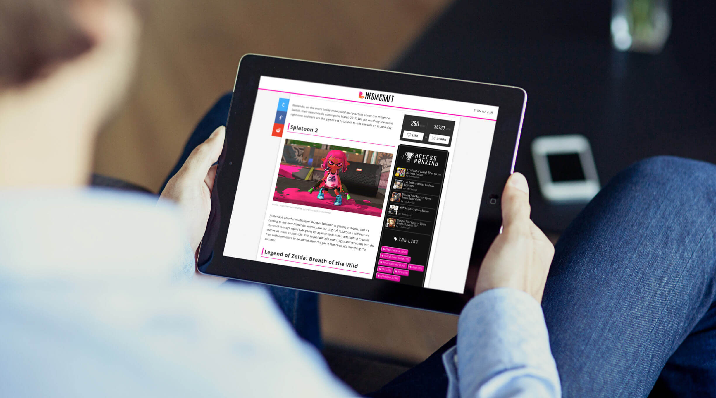
Unicom designed the logo and website for RockU Mediacraft, a curation media for gamers run by Unicom Corporation. Because we are a media company that deals with games, we put a lot of importance on a sense of fun and gamesmanship.
The logo is an abstraction of the initials "R" and "U" of RockU, which are combined to form a three-dimensional shape. The logo is designed to be easy to use both as a stand-alone logo and in combination with other services, so that when derivative services are released in the future, they will be able to show that they are both branded services. The "Mediacraft" logo typo has a digital and geeky feel to it.

LOGOTYPE / BASE
Heroic Concesed - Medium

TEXT
Oswald - Regular
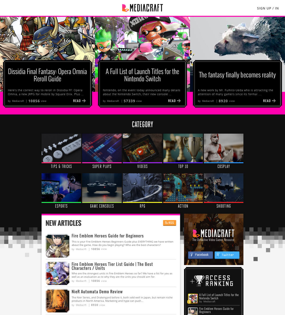
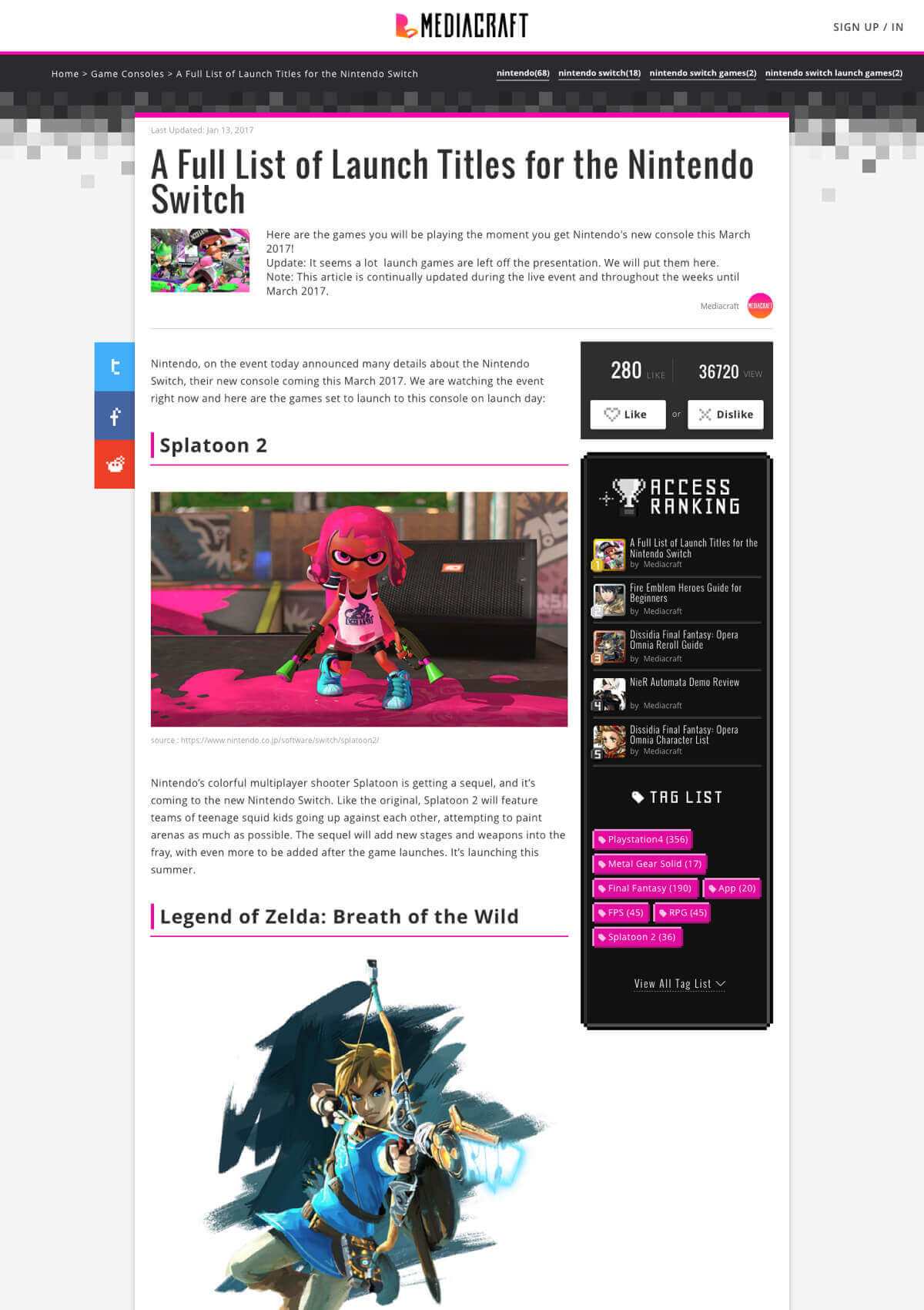
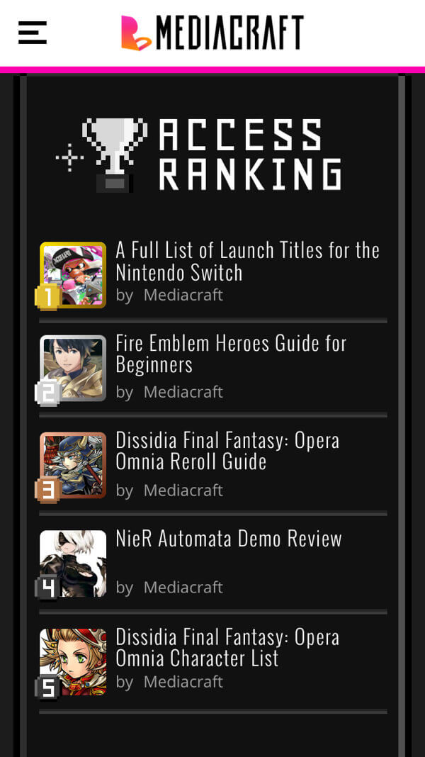
8BIT DESIGN
WEBサイト全体のデザインコンセプトは"8bit"。デジタルゲームならではのドット表現を様々なパーツに採用しています。投稿される記事内容との親和性の高さもそうですが、内容問わず、ただサイトを観覧しているだけでもどこかにゲームらしい楽しさを感じてもらえるよう、ボタンやピクトグラムといった細部まで作り込まれています。
The overall design concept of the website is "8-bit". The dot expression unique to digital games is used for various parts of the website. The website is designed in detail such as buttons and pictograms so that users can feel the fun of games regardless of the content of the articles and the affinity with the contents.
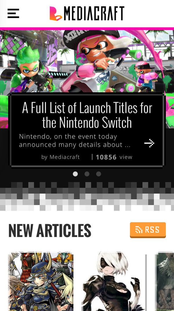
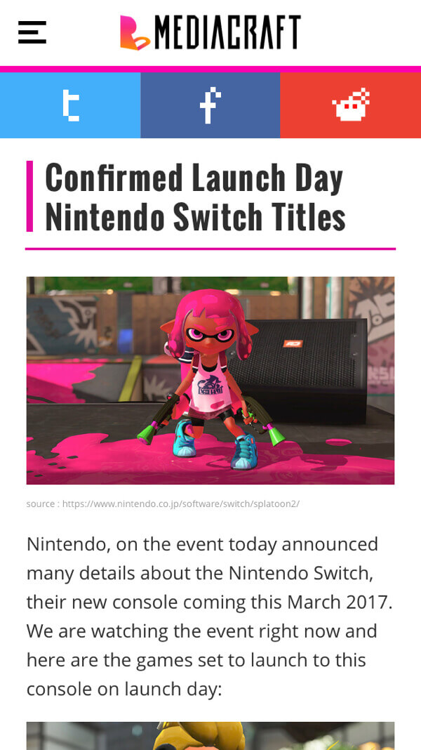
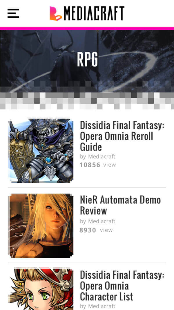


FRESH COLOR
色使いについても彩度の高いものを採用し、"POPさ"、"若さ"、"海外らしさ"といった印象を与えられるように意識されています。
The color palette is highly saturated to give the impression of "pop", "youthfulness", and "foreignness".