FRUOATS
BRAND SITE
CRAFT
WEB SITE
美味しさの表現
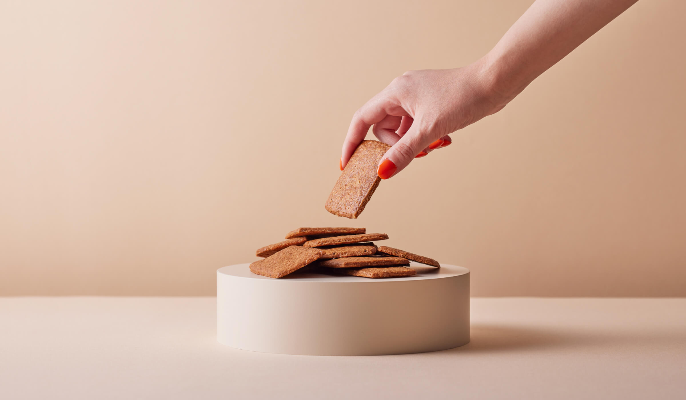
CRAFT株式会社が展開する、オートミール×おからのグルテンフリークッキー「FruOats(フルオーツ)」のブランドサイトのリニューアルデザインを担当させて頂きました。FruOatsはオートミールやおから、チアシード、ドライフルーツ、アマニなど、全て植物由来のシンプルな素材でつくられた、からだにやさしいクッキーブランドです。
A seeker of questions who remains curious.
We were in charge of the renewal design of the website for FruOats, a brand of oatmeal and okara gluten-free cookies developed by CRAFT inc. FruOats is a healthy cookie brand made with simple, plant-based ingredients such as oatmeal, okara, chia seeds, dried fruits, and amanis. FruOats is a healthy cookie brand made from simple plant-based ingredients such as oatmeal, bean curd, chia seeds, dried fruits, and amani.
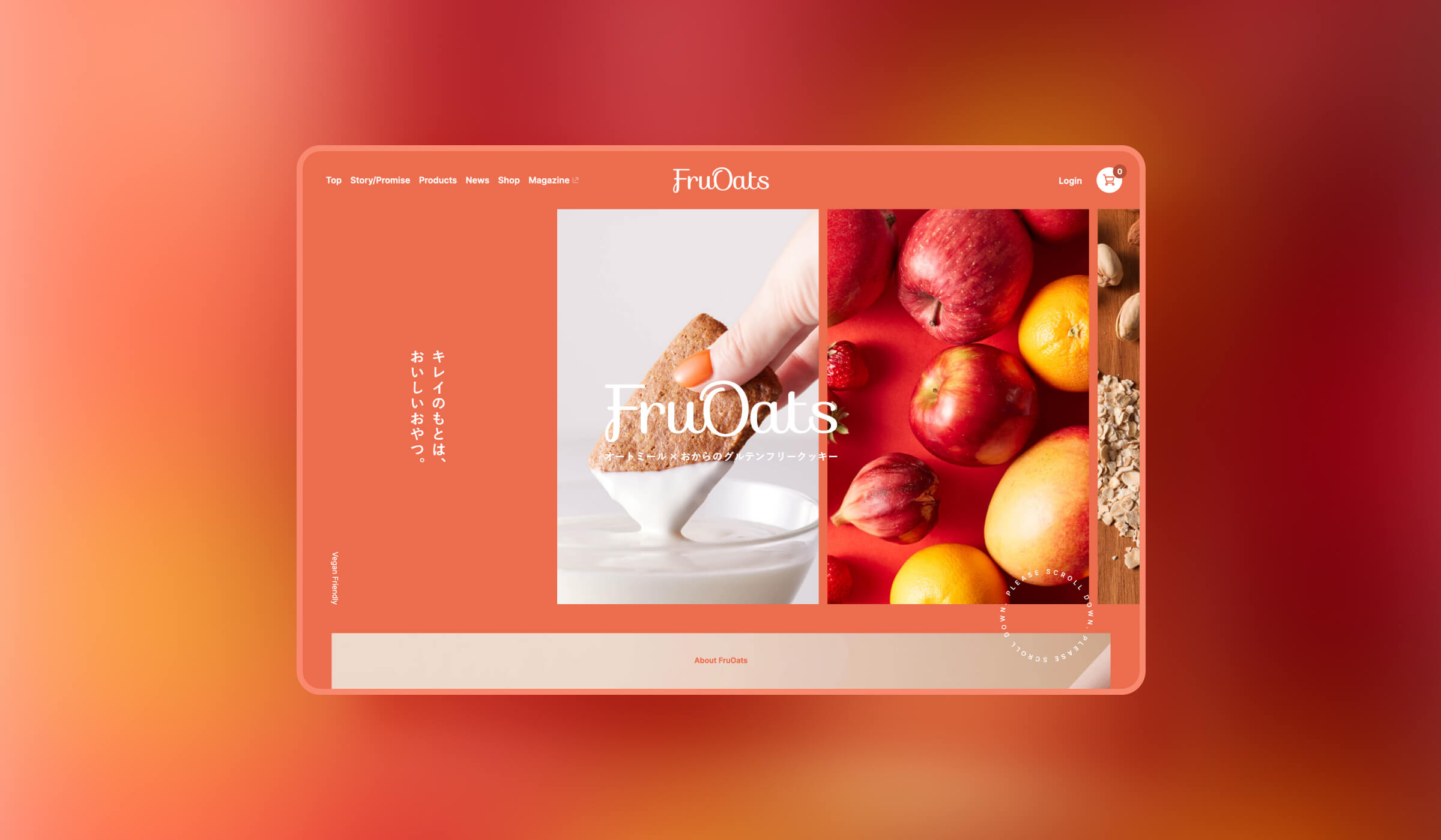
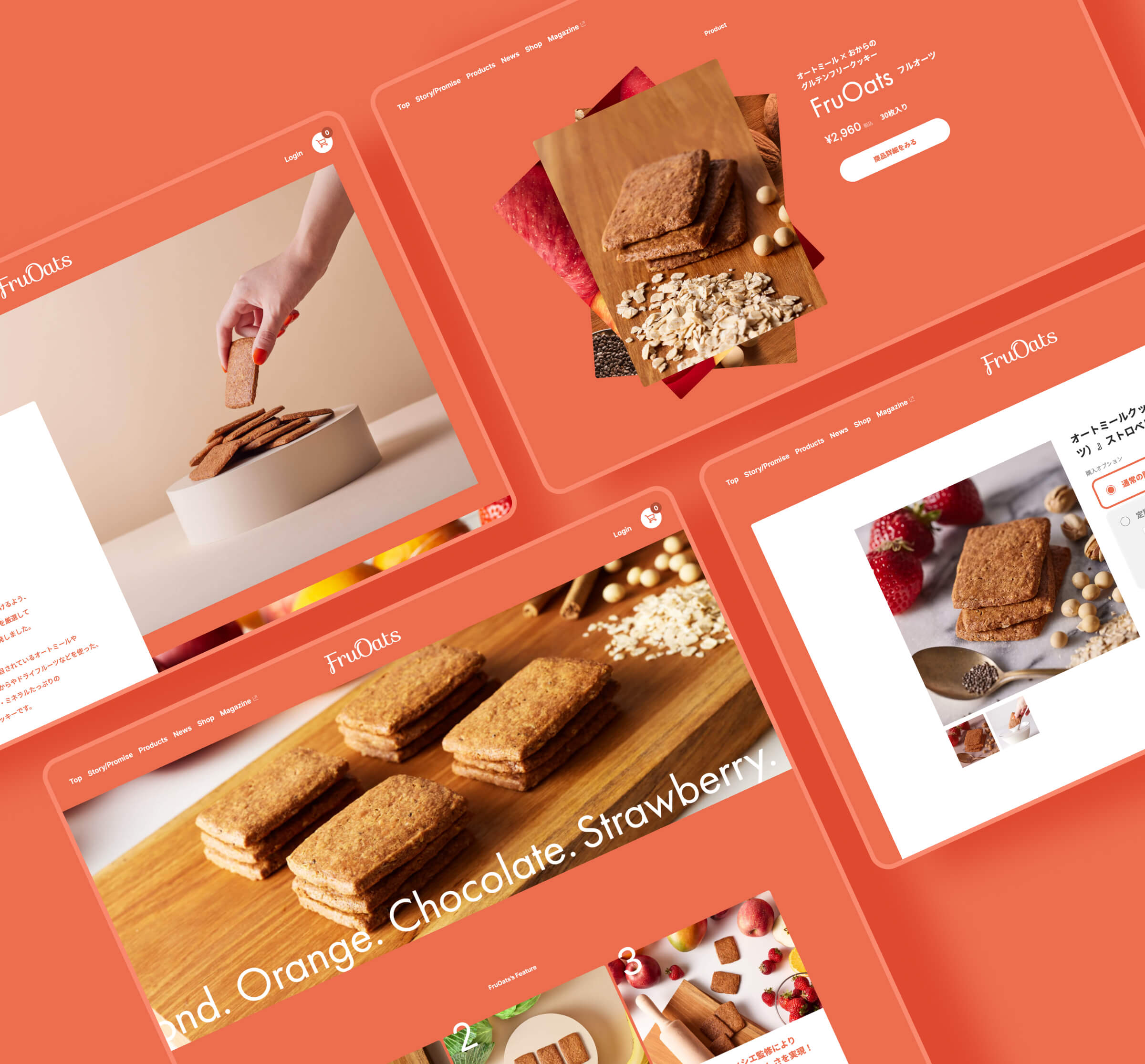
今回のリニューアルデザインにおいては、目に見えないブランドとしての強みをブランドサイトを通じて感じとってもらえるよう特に注力させて頂きました。からだにやさしい、けれども美味しい味である事を伝えるシズル感の表現。一度訪れたら印象に残るブランドカラーの大胆な使い方、そしてフレーバーを視覚的に感じられる果実そのものの色使い。そして、商品展開自体はシンプルながらも、それ以上にワクワクを感じられるレイアウトを心がけました。
In this renewal design, we focused on the invisible strengths of the brand, which can be felt through the brand website. The sizzle of the website conveys the healthful, yet delicious taste of the product. The bold use of brand colors that leave a lasting impression once you visit the site, and the use of fruit colors that allow you to visually perceive the flavors. We also tried to create a layout that is simple in terms of the product lineup itself, but more exciting than that.