CHOCOLAPHIL
BAKE inc.
WEB SITE
反響する不思議な世界
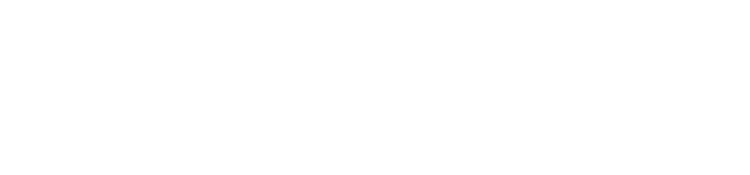
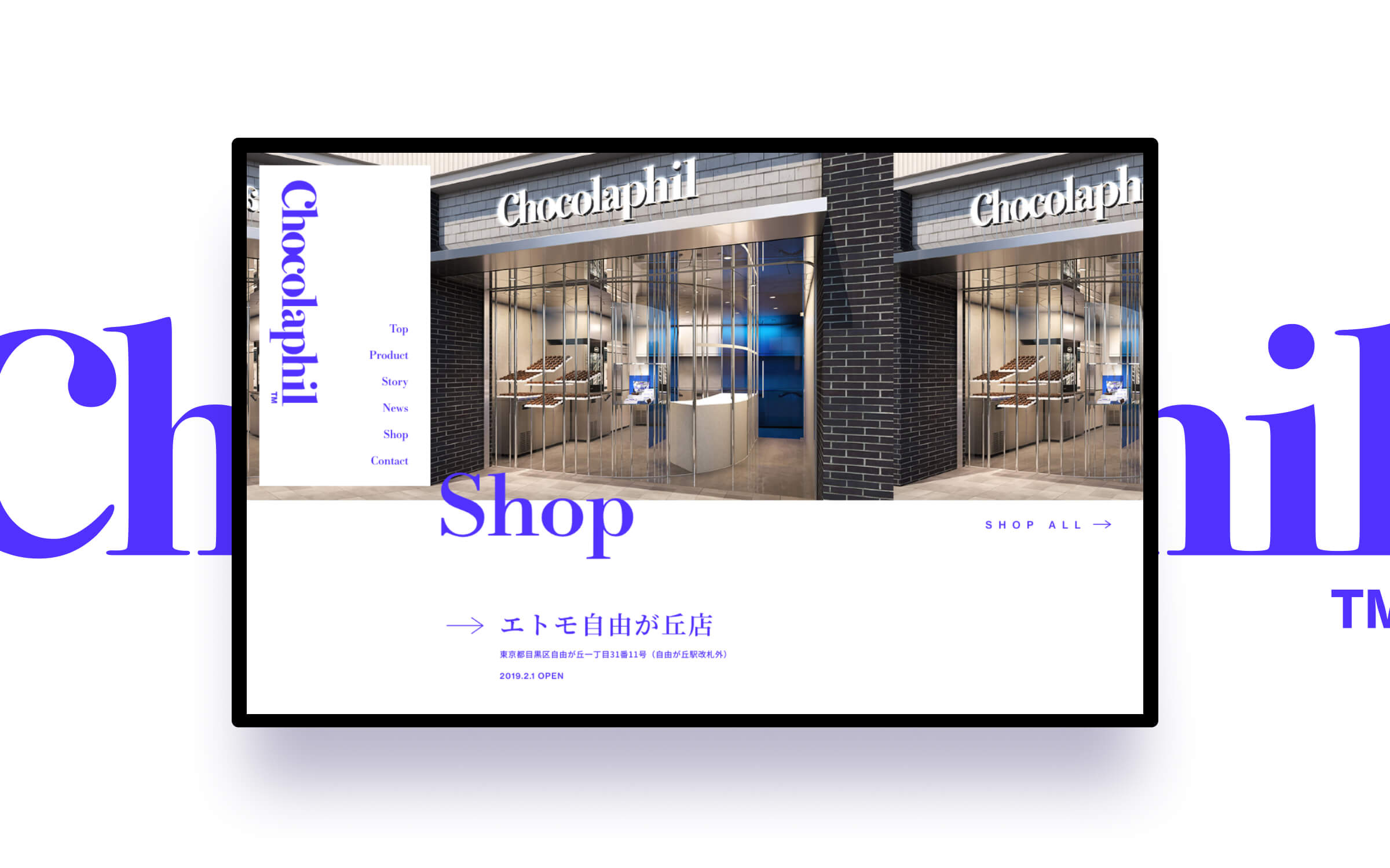
株式会社BAKEが展開する、“チョコレートよりもチョコレートを感じるガトーショコラ”をコンセプトとしたガトーショコラ専門店「Chocolaphil™(ショコラフィル™)」のブランドサイトデザインを担当させていただきました。
ブランドカラーである鮮やかな青色「ウルトラマリン」は、広大な海を越えてきたカカオをイメージソースとしたもの。従来のチョコレートブランドとはひと目で違うものと伝わるその強い存在感を、サイトデザインにおいても強く意識しながら盛り込み、パッケージ・店舗と一体感を感じられる世界観の構築を目指しました。
A mysterious world of echoes
We were in charge of the brand website design for "Chocolaphil™", a specialty store of chocolate gateau chocolates developed by BAKE Corporation, with the concept of "gateau chocolates that feel more like chocolate than chocolate". I was in charge of the brand website design.
The bright blue color of the brand, "Ultramarine," is based on the image of cacao that has crossed the vast ocean. The strong presence of Ultramarine, which is instantly recognizable as being different from conventional chocolate brands, was incorporated into the website design with a strong sense of awareness, aiming to create a worldview that is integrated with the packaging and stores.
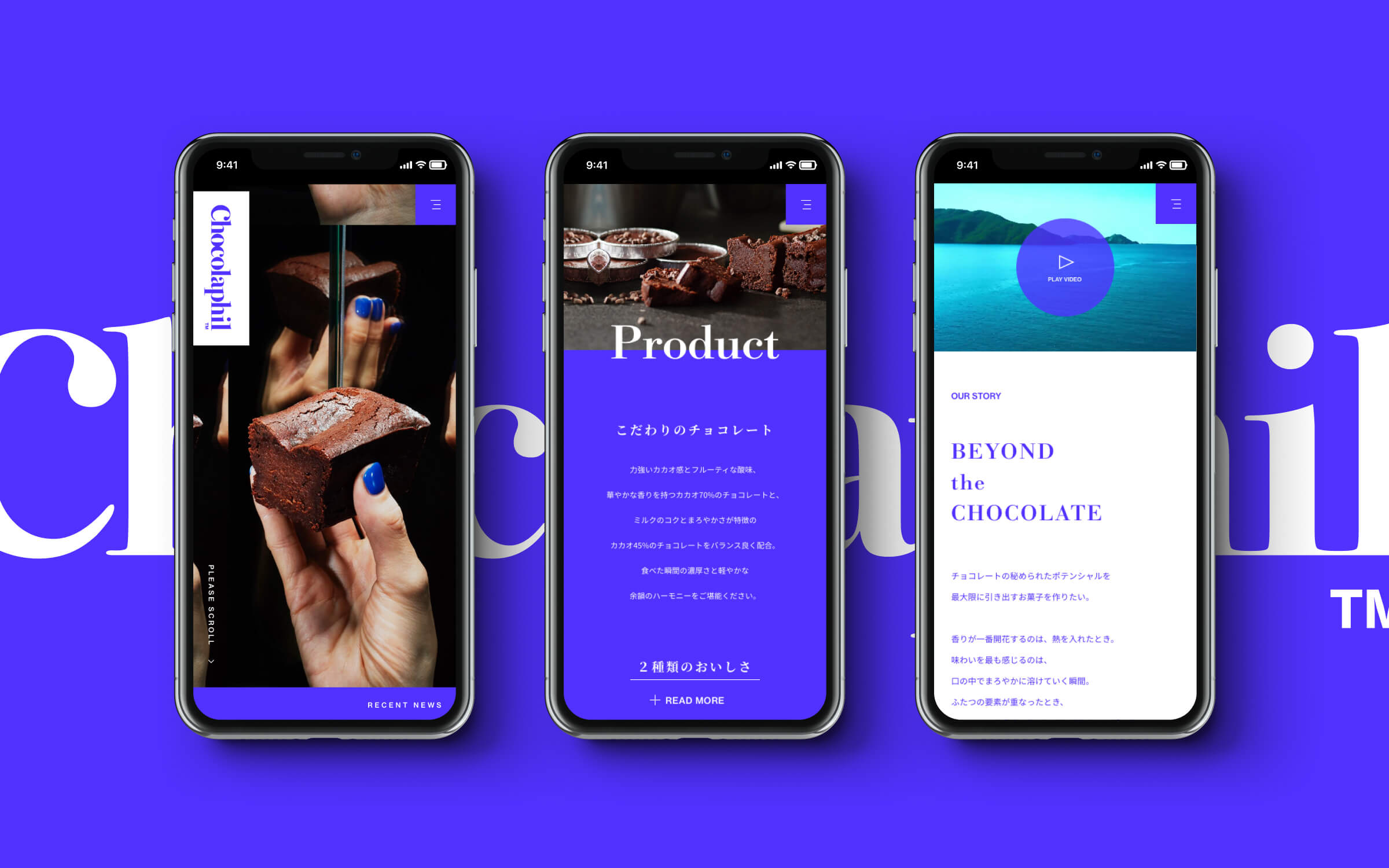
世界観をつくる上でもうひとつ大きなコンセプトとしたのが、「反響(リフレクション)」です。これは一粒のカカオから派生するものの広がりの表現でもあり、チョコレート製品では昔からおなじみの「銀紙」からインスピレーションを受けたマテリアル的な表現でもあります。ブランドサイト上では、スライドショーやスクロール連動などの動きを感じる箇所で、まるで鏡に写り込んだ世界のような、少し不思議で、良い意味で違和感を感じさせる表現を心がけました。
Another major concept in creating the world view was "reflection". This is an expression of the expansion of what is derived from a single grain of cacao, and is also a material expression inspired by silver paper, which has been used in chocolate products for a long time. On the brand's website, I tried to create a sense of movement with slideshows and scrolling links, as if the world were reflected in a mirror, which is a little strange and uncomfortable in a good way.

HEADING
BodoniClassico - Bold

TEXT
Noto Serif CJK JP - Regular