KERN INC.
Kern inc.
WEB SITE
アイデンティティが主役のサイト
スタートアップ企業をはじめ、幅広い領域でアイデンティ・デザインの設計・制作に従事する株式会社kern(ケルン)のコーポレートサイトデザインを担当させて頂きました。
A site where identity takes center stage.
We designed the corporate website for kern, a company engaged in identity design and production for a wide range of fields, including start-up companies.
今回デザインするにあたり、大きく分けて2つのポイントに注力しました。
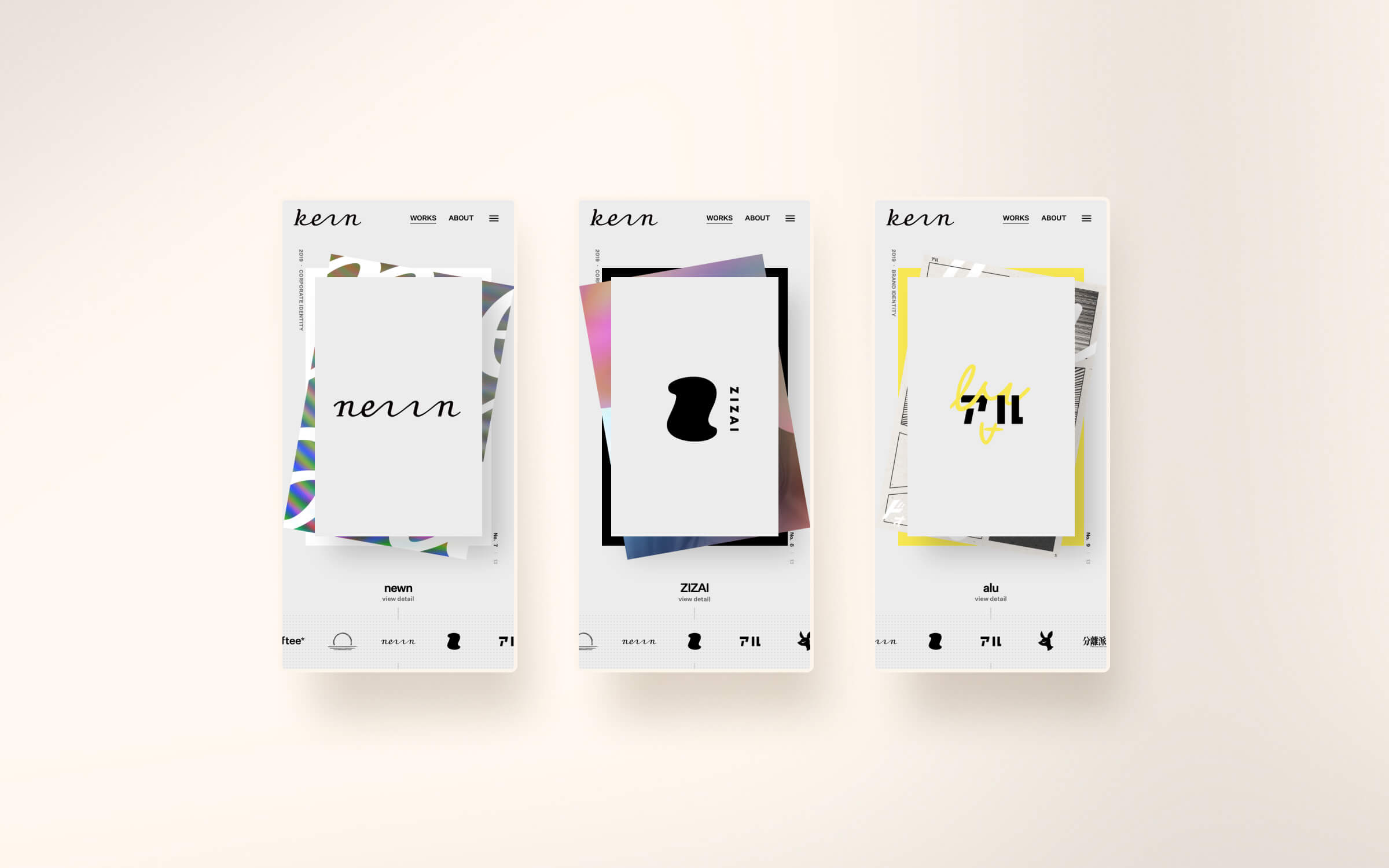
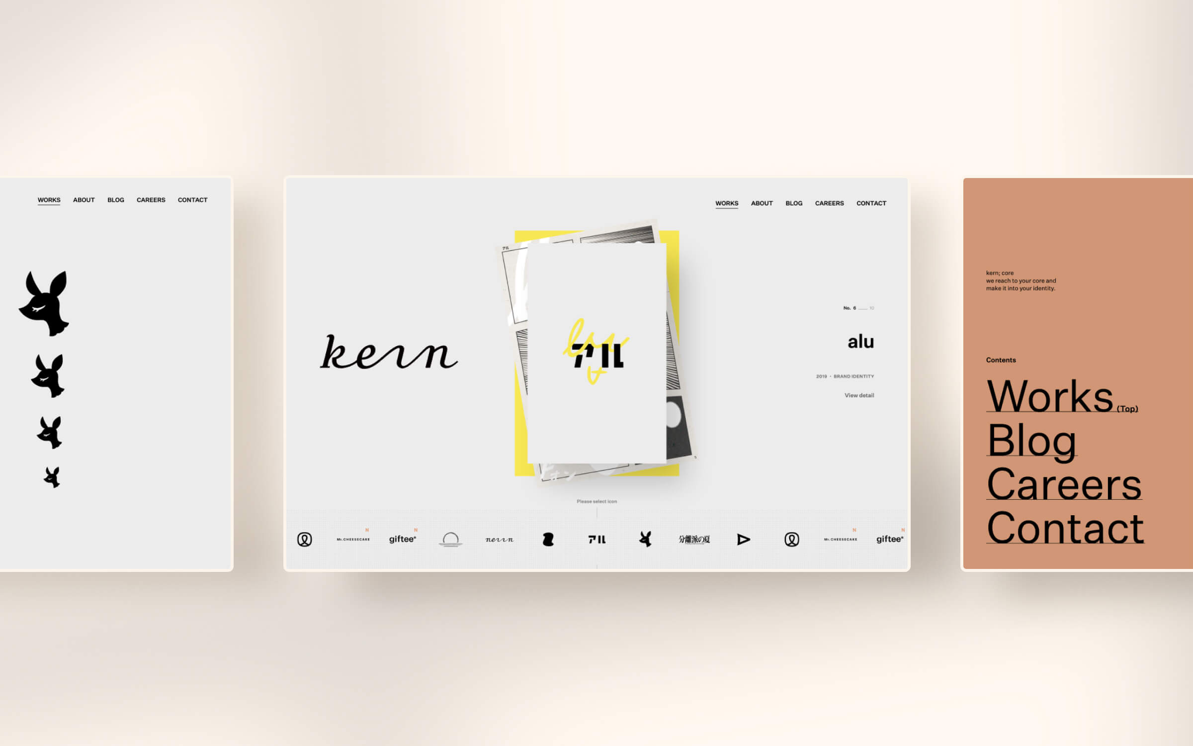
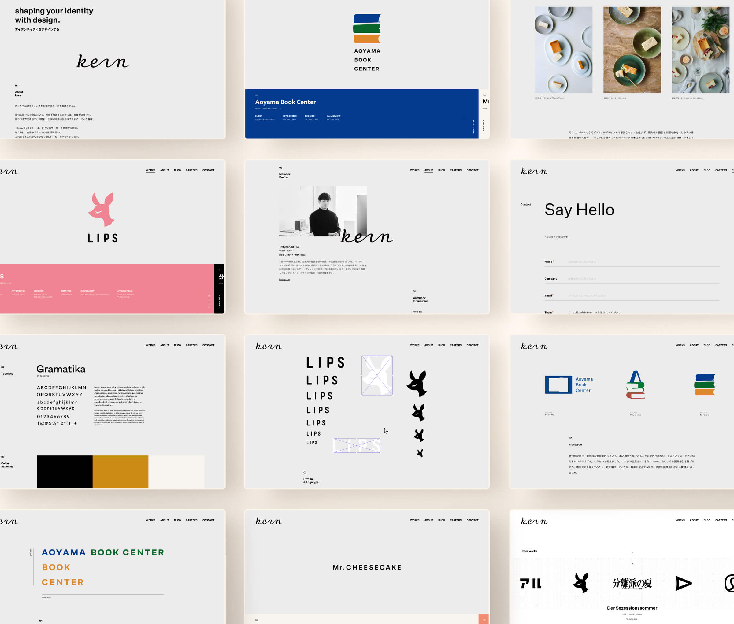
1つ目は”kernだから実現出来るコーポレートサイト”であること。kernという会社がアイディティの設計・制作を強みにしているという事をサイト自身のUIを通しても伝えたい、そういった想いで制作させて頂きました。単なる一覧表示にするのではなく、ロゴ自身をナビゲーション用のボタンに活用するといった工夫も盛り込まれています。これは比較的小さめなサイズで活用することにもなるので、結果として「制作されたロゴが小さく表示されたときの審美性、分かりやすさ」の実践の場にもなっています。
In designing this project, I focused on two main points.
The first was to create a corporate site that could only be realized by kern, and we wanted to convey through the site's UI that kern is a company that excels at designing and creating ideas. Rather than simply displaying a list, the logo itself is used as a button for navigation. This also means that the logo is used in a relatively small size, and as a result, it becomes a place to practice "aesthetics and clarity when the created logo is displayed in a small size.
2つ目はスマホ環境での閲覧体験を最大化させること。得てしてこういったポートフォリオサイトはPCなど大画面で見られることを前提にして制作されることが多いのですが、kernのサイト設計ではむしろスマホ環境のような小さめのディスプレイ&タッチデバイス環境で見たほうがより面白い体験になるよう意識して制作させて頂きました。サイト全体を通して少しアナログ感のある落ち着いた質感、文字組みを意識しつつ、実際に触れているように感じられる小さな歪みのインタラクション、ページをめくるような気持ちよさが盛り込まれています。サイトの構成としては一見シンプルに見せつつも、他のコーポレートサイトとは一味違う、細部までこだわりが詰め込まれたサイトです。
The second is to maximize the viewing experience on a smartphone environment. Portfolio sites are often created with the assumption that they will be viewed on a large screen such as a PC, but in the design of the kern site, we made sure that the experience would be more interesting when viewed on a smaller display and touch device environment such as a smartphone. The entire site has a slightly analog feel. The entire site has a calm, analog feel, with an awareness of the text structure, and the interaction of small distortions that make you feel as if you are actually touching the site, and the pleasant feeling of turning the pages. The site's structure looks simple at first glance, but it is different from other corporate sites in that it is packed with details.